
Basics of Graphics
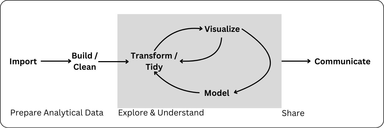
Data Science Workflow
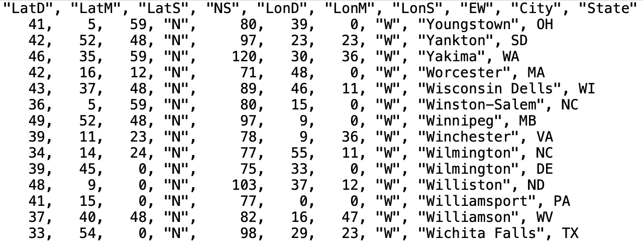
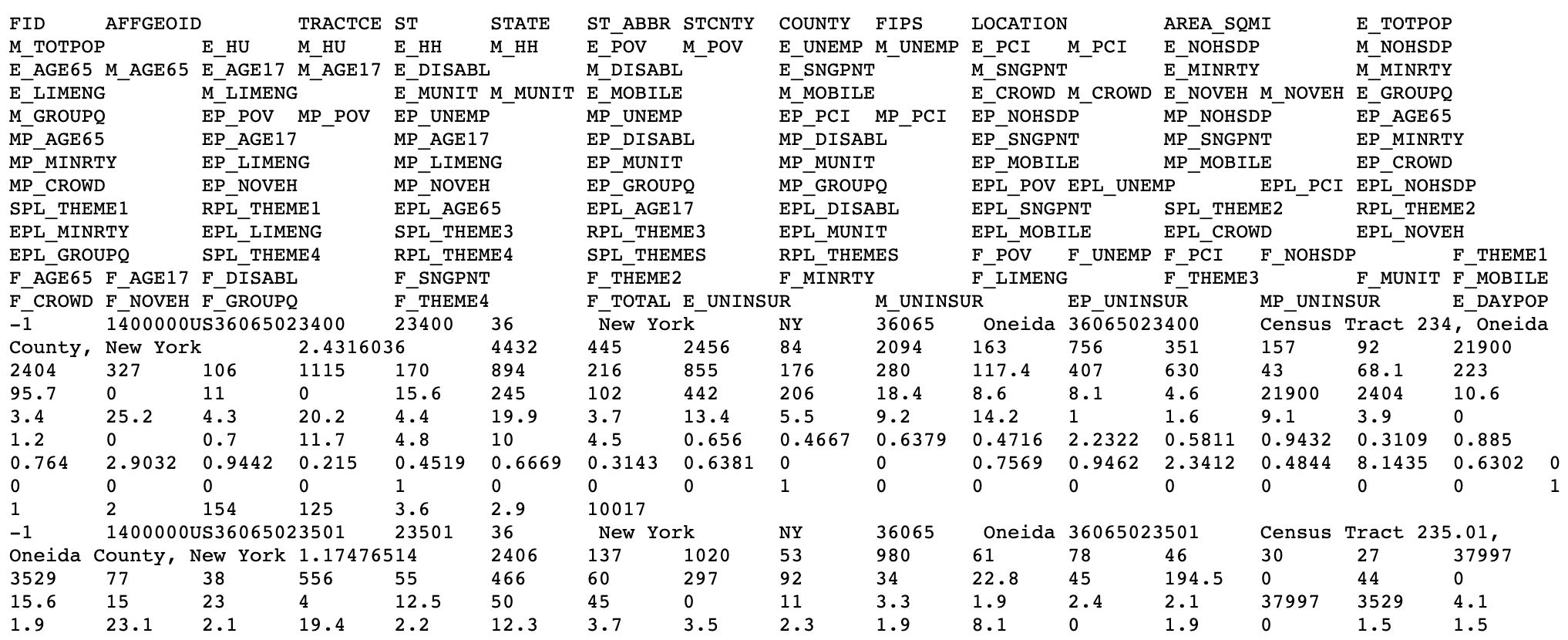
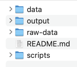
Common Types of Data Files
Reminder: Notebooks and File Paths
You have to tell
Rwhere to “find” the data you want to read in using a file path.Quarto automatically sets the working directory to the be directory where the Quarto document is for any code within the Quarto document
This overrides the directory set by an .Rproj
Pay attention to this when setting relative filepaths
- To “backout” of one directory, use
"../" - e.g.:
"../data/dat.csv"
- To “backout” of one directory, use
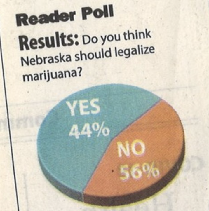
What makes bad graphics bad?
- BAD DATA.
- Too much “chartjunk” – superfluous details (Tufte).
- Design choices that are difficult for the human brain to process, including:
- Colors
- Orientation
- Organization
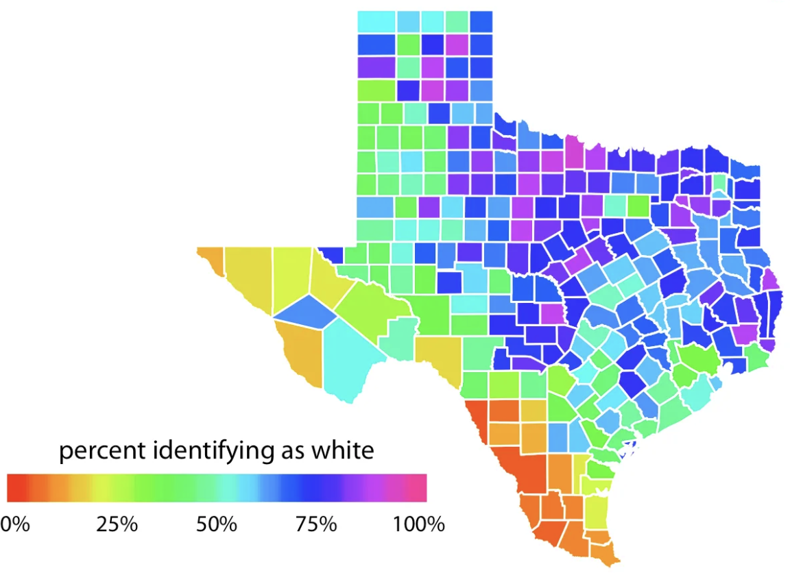
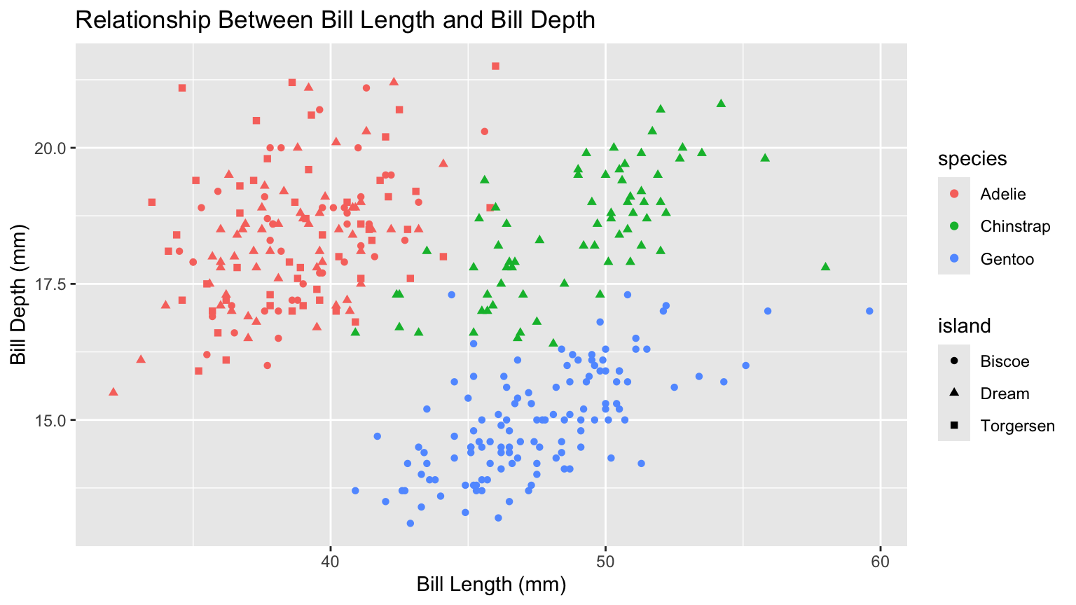
Color Guidelines
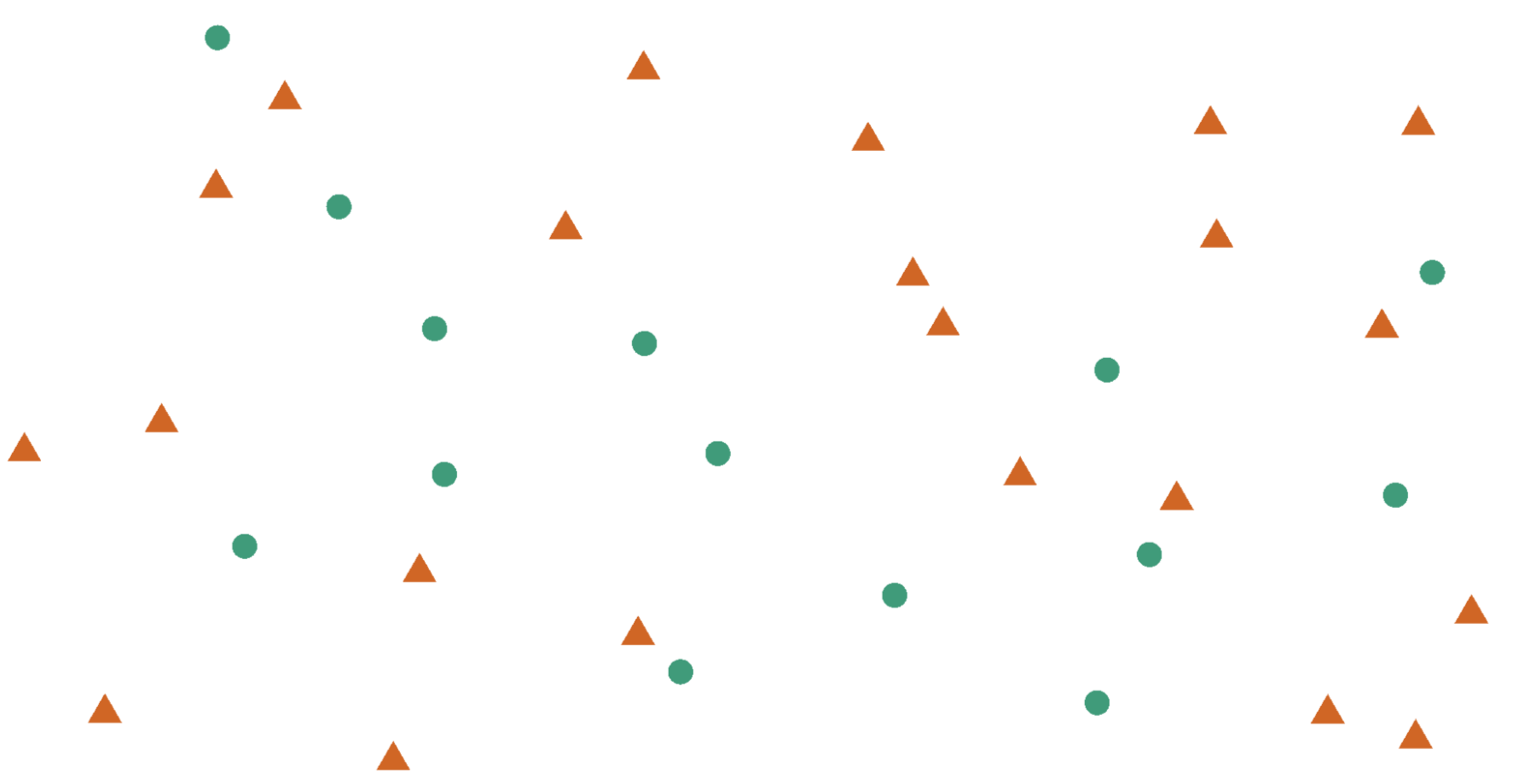
Do not use rainbow color gradients!
Be conscious of what certain colors “mean”.
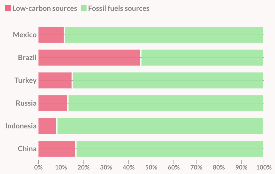
- Good idea to use red for “good” and green for “bad”???
Color Guidelines
To colorblind-proof a graphic…
- use double encoding - when you use color, also use another aesthetic (line type, shape, etc.).
Color Guidelines
To colorblind-proof a graphic…
- with a unidirectional scale (e.g., all + values), use a monochromatic color gradient.
- with a bidirectional scale (e.g., + and - values), use a purple-white-orange color gradient. Transition through white!

Color Guidelines
To colorblind-proof a graphic…
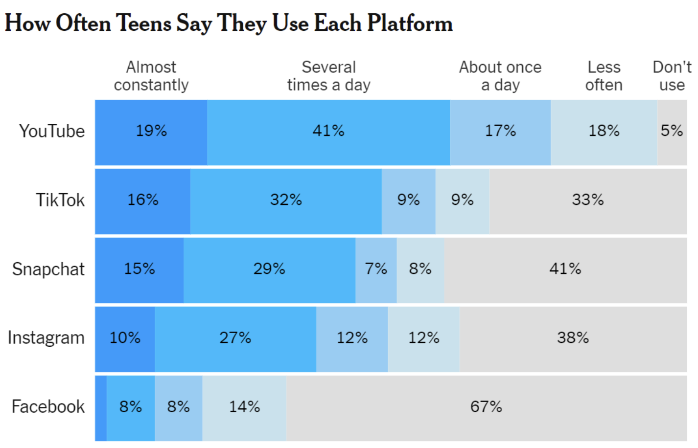
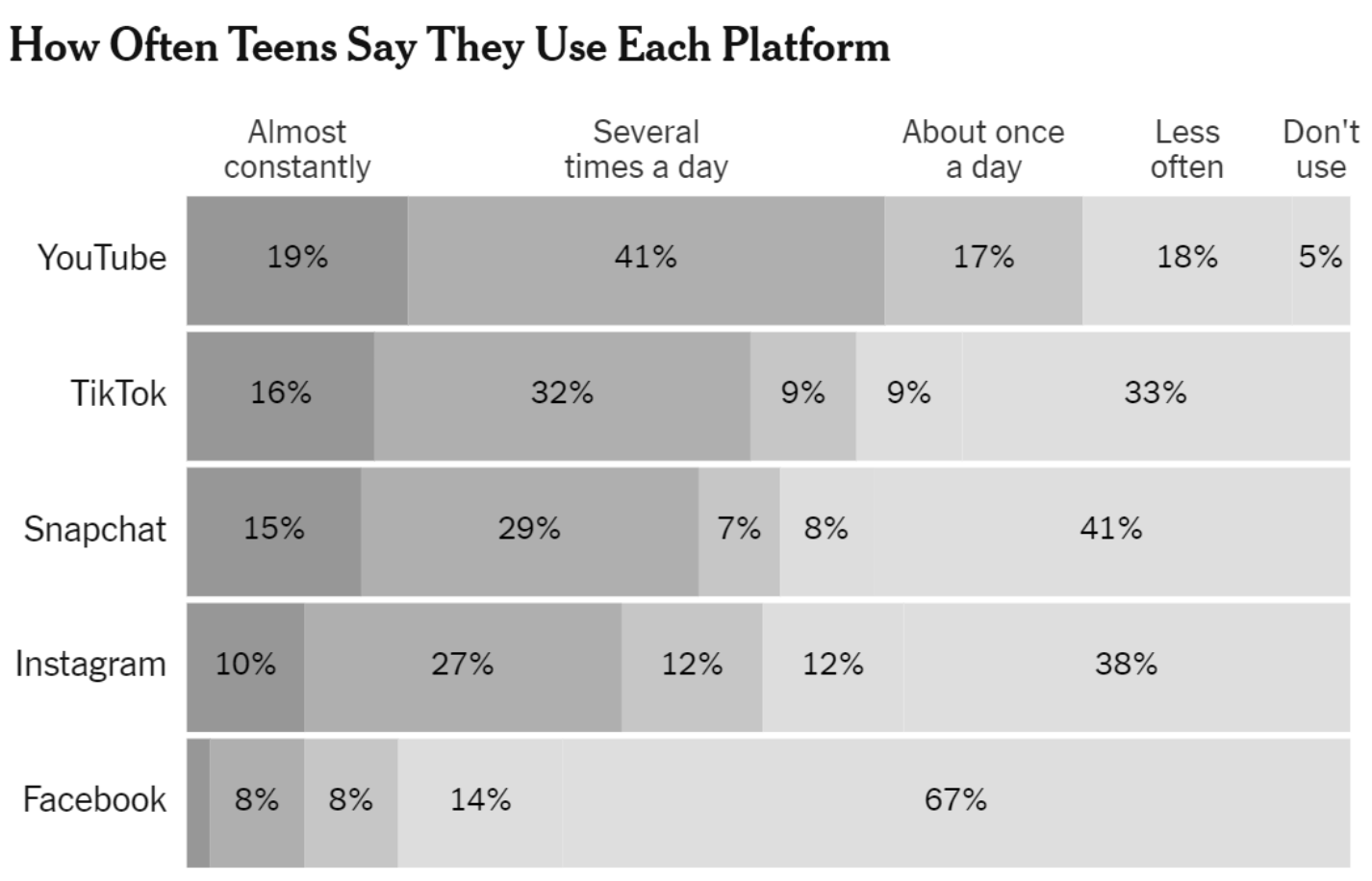
- print your chart out in black and white – if you can still read it, it will be safe for all users.
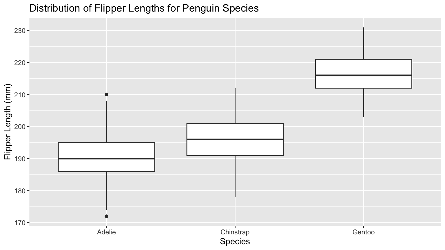
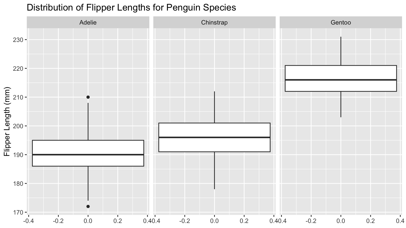
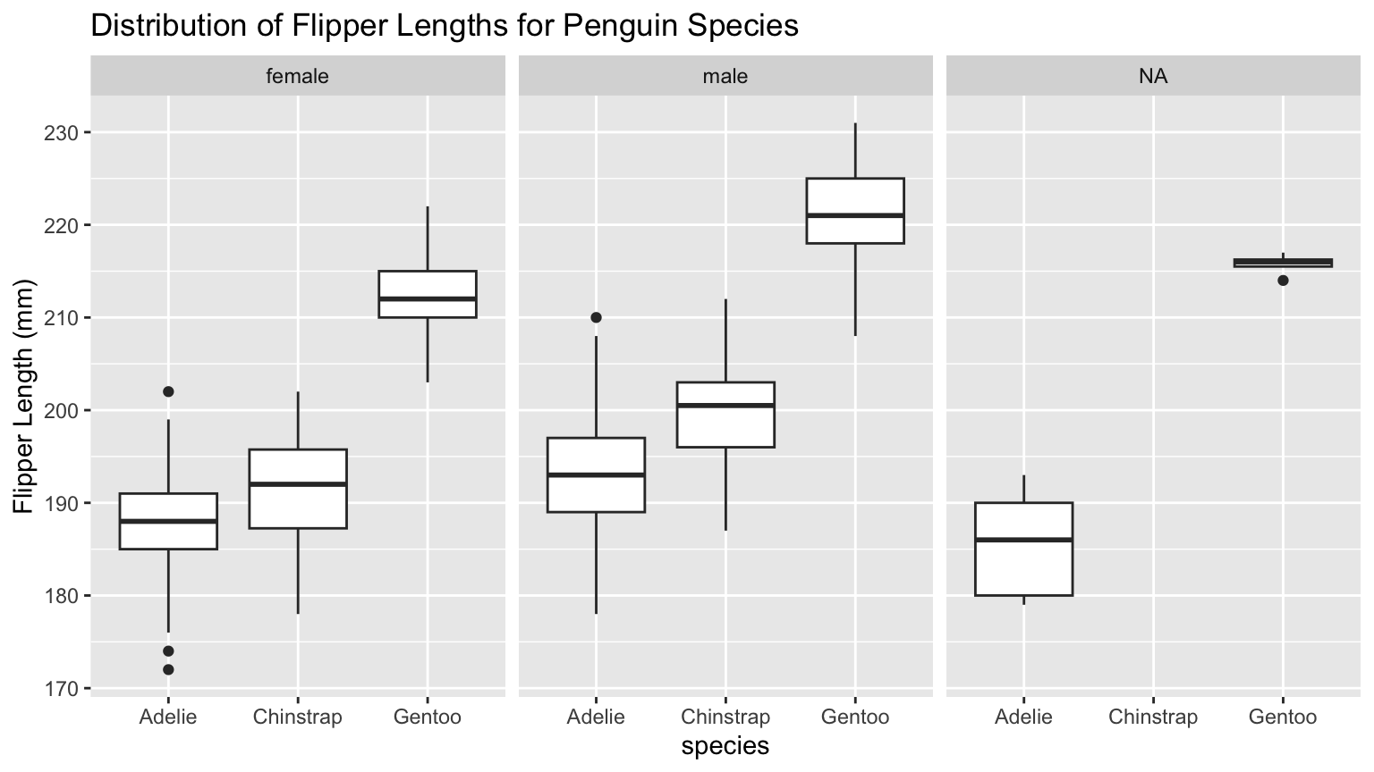
Penguins - Flipper Length by Species
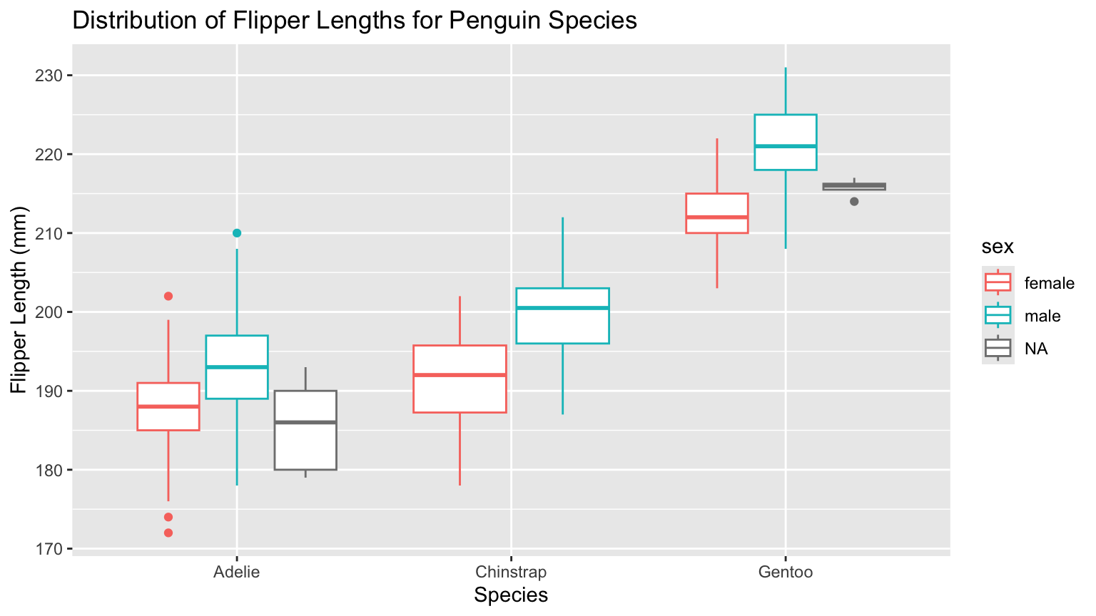
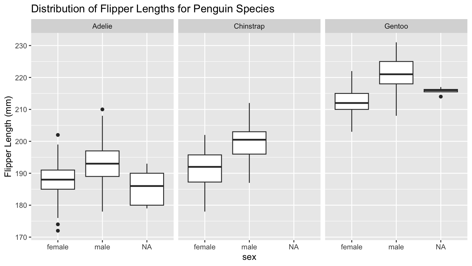
Penguins - Flipper Length by Species & Sex
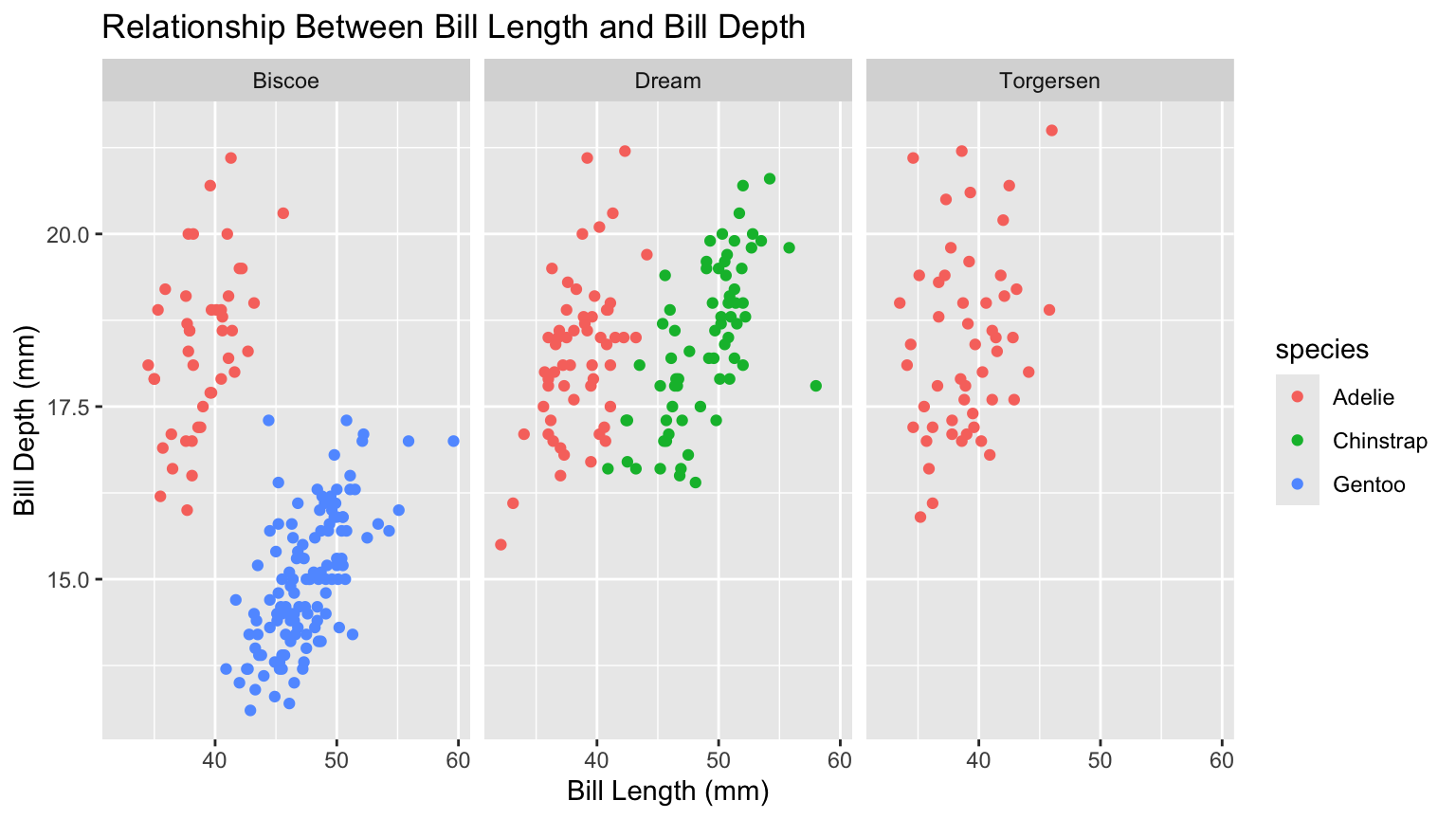
PA 2 Example - Two Categorical Variables
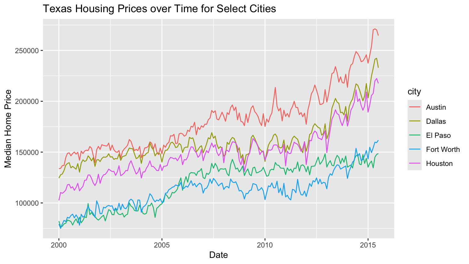
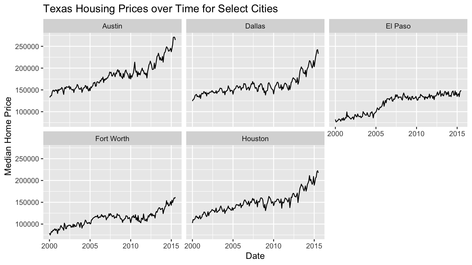
Lecture Example - Texas Housing Data
Example 1
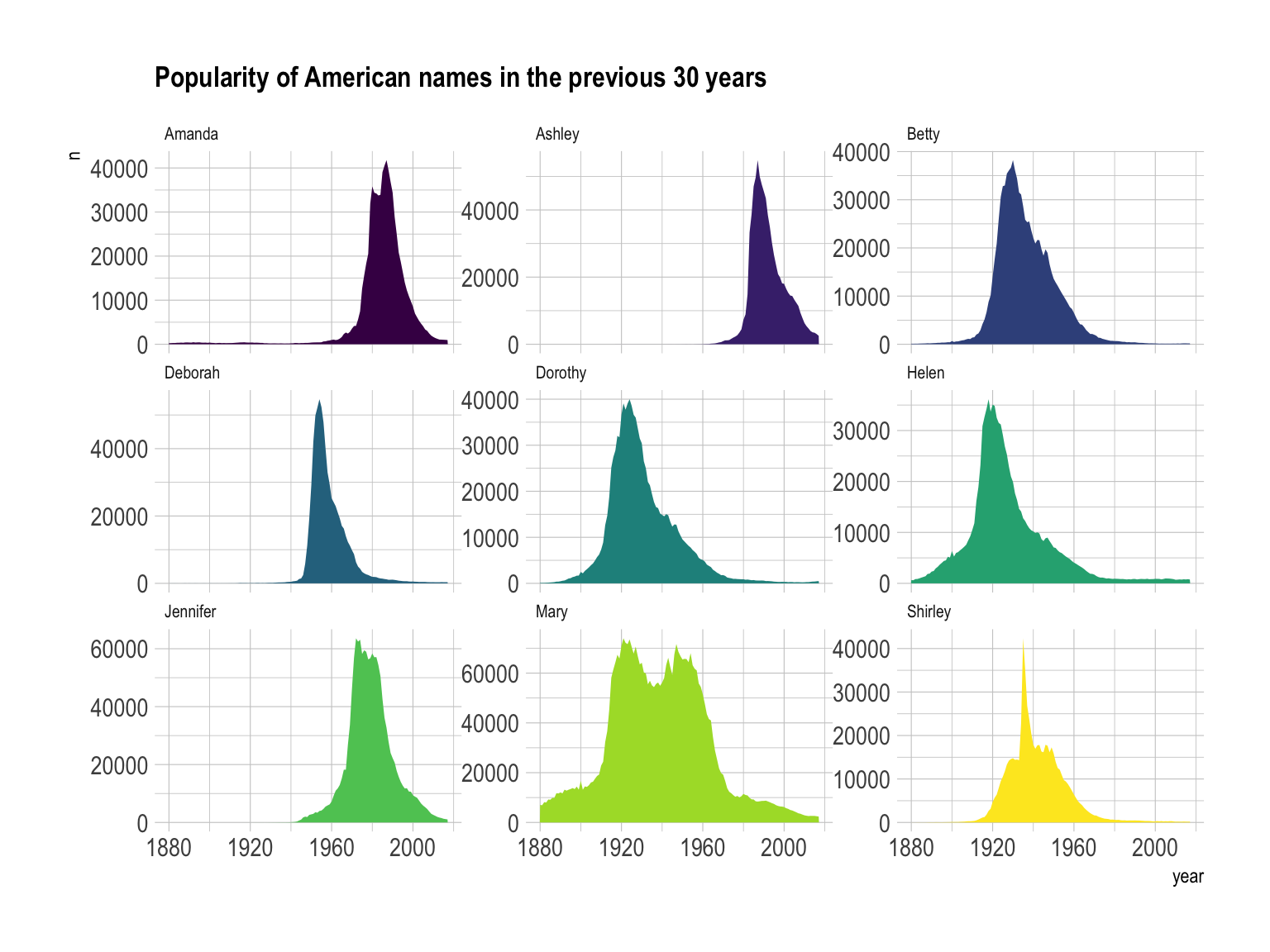
https://www.data-to-viz.com/graph/area.html
Example 2
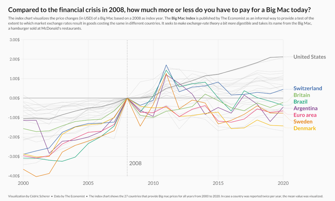
https://r-graph-gallery.com/web-vertical-line-chart-with-ggplot2.html
Example 3
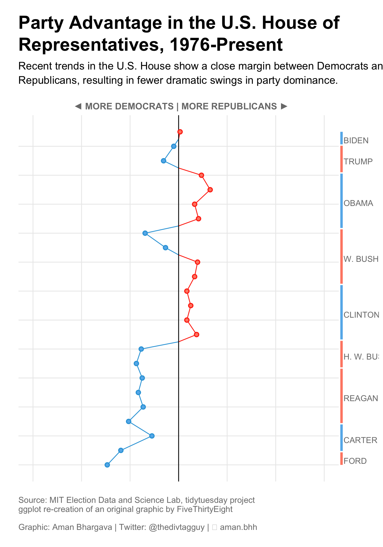
https://r-graph-gallery.com/web-line-chart-with-labels-at-end-of-line.html
Lab 2: Exploring Rodents with ggplot2

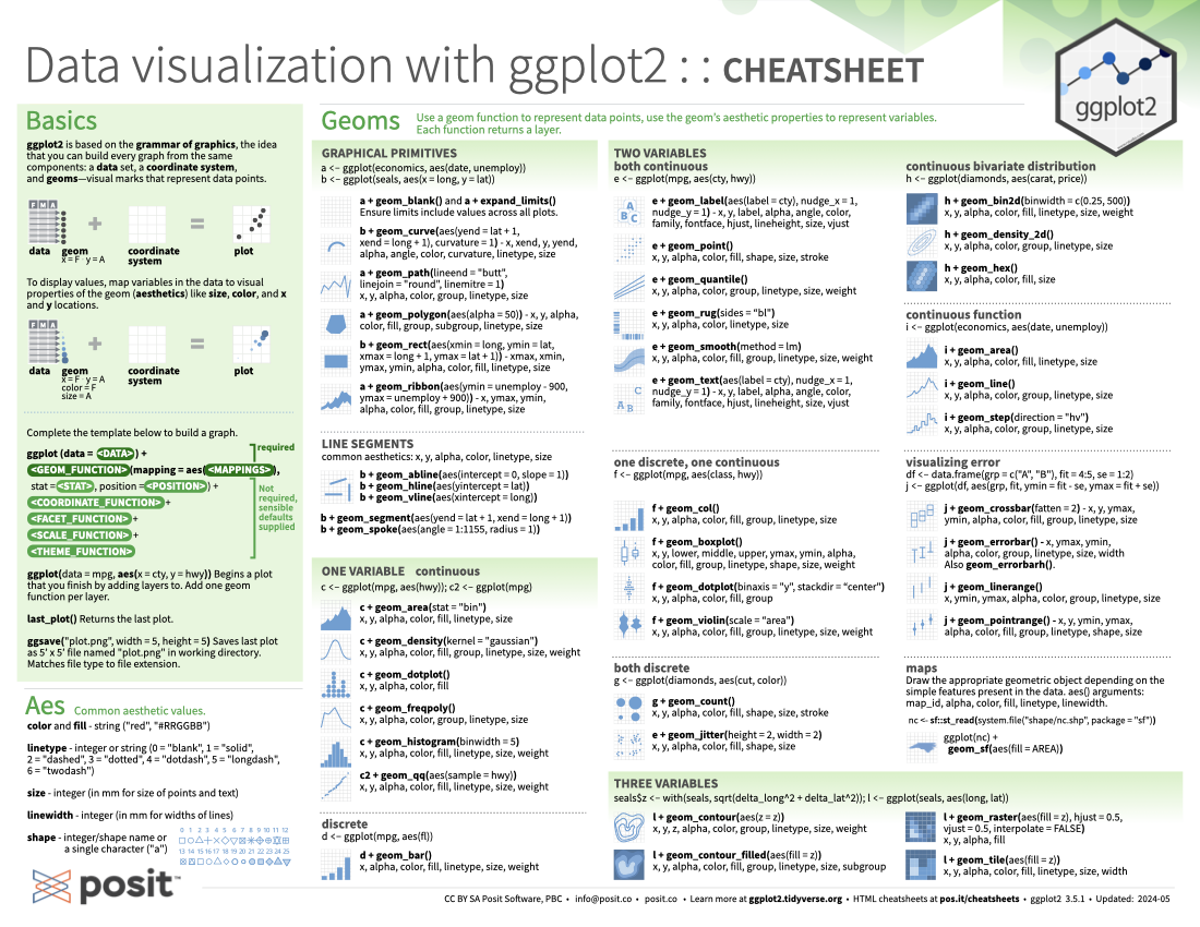
ggplot2 cheatsheet