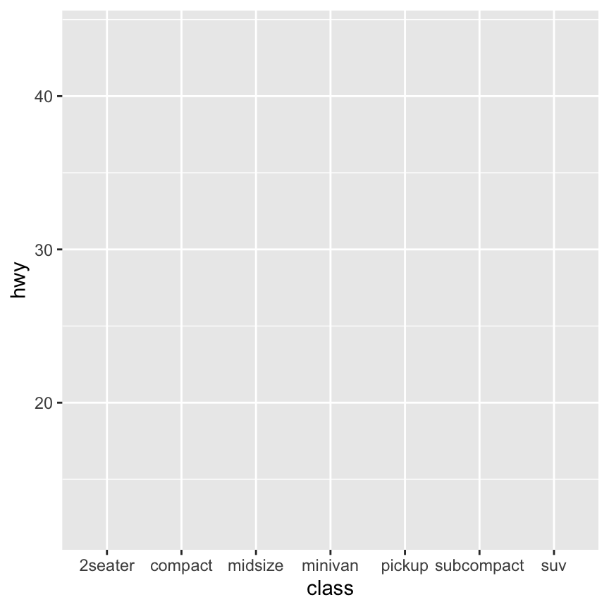
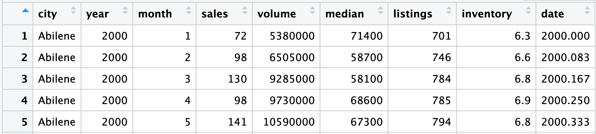
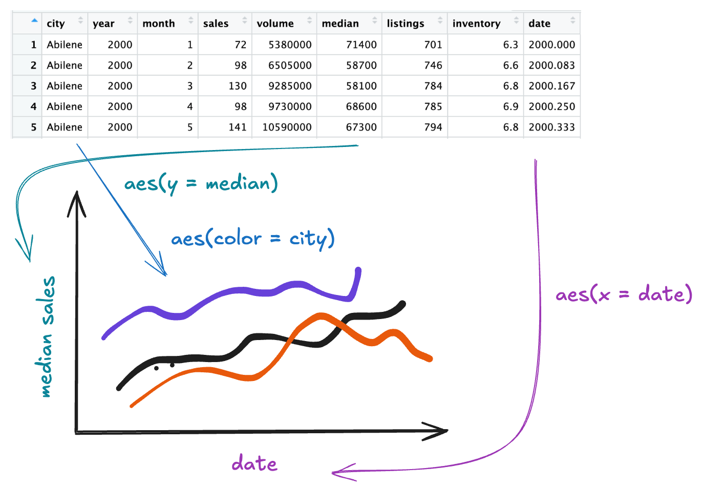
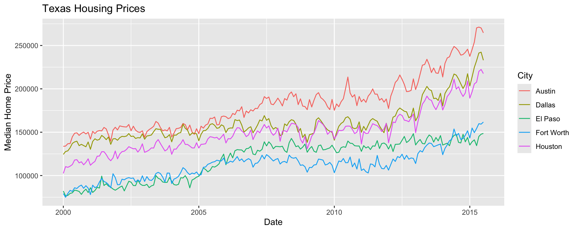
Graphics with ggplot2
Tidywho?
The tidyverse is an opinionated collection of R packages designed for data science. All packages share an underlying design philosophy, grammar, and data structures.1
- Most of the functionality you will need for an entire data analysis workflow with cohesive grammar

Practice 🧩
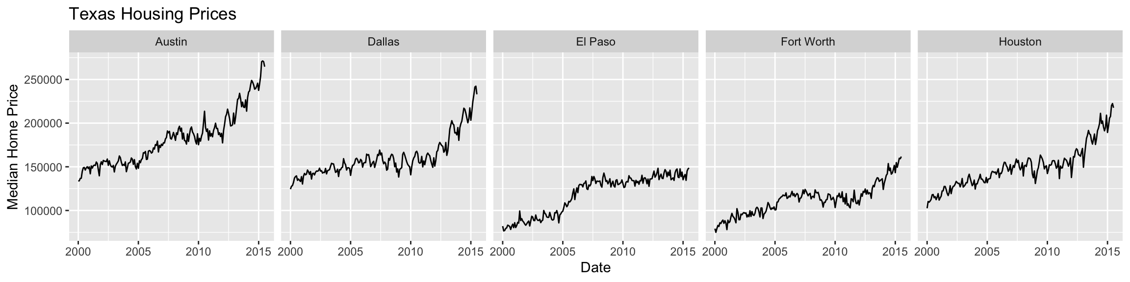
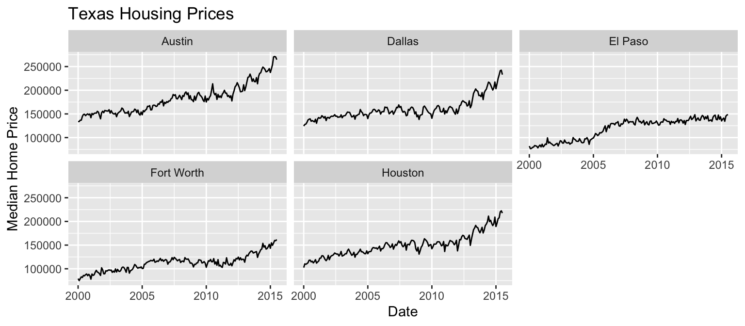
Faceting
Extracts subsets of data and places them in side-by-side plots.
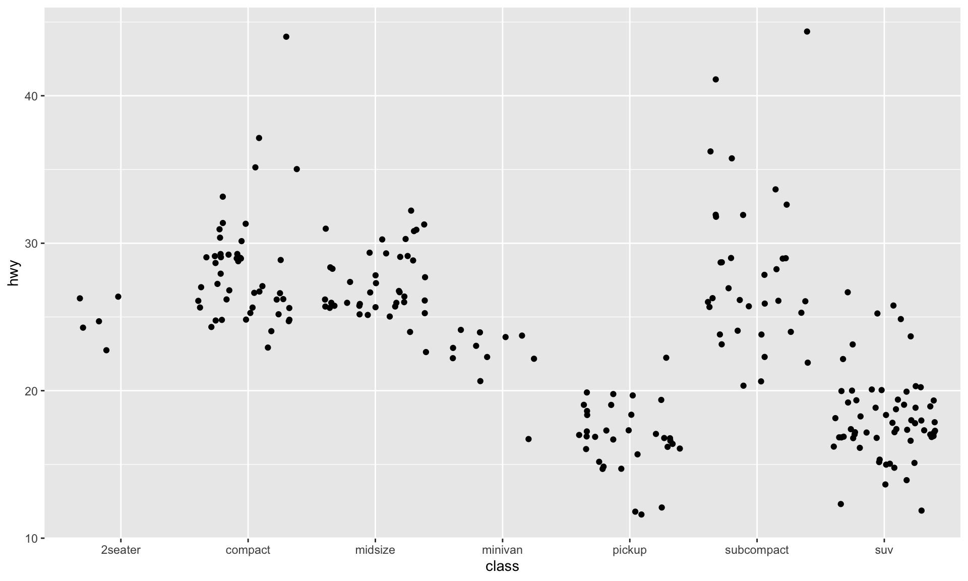
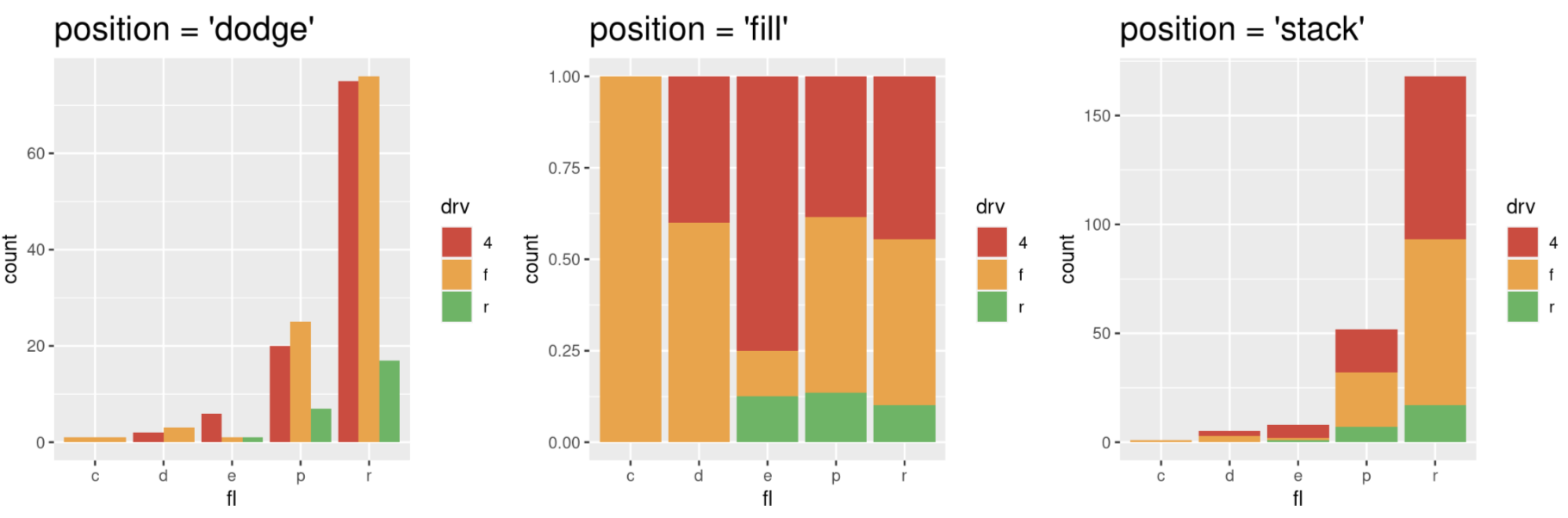
Position Adjustments
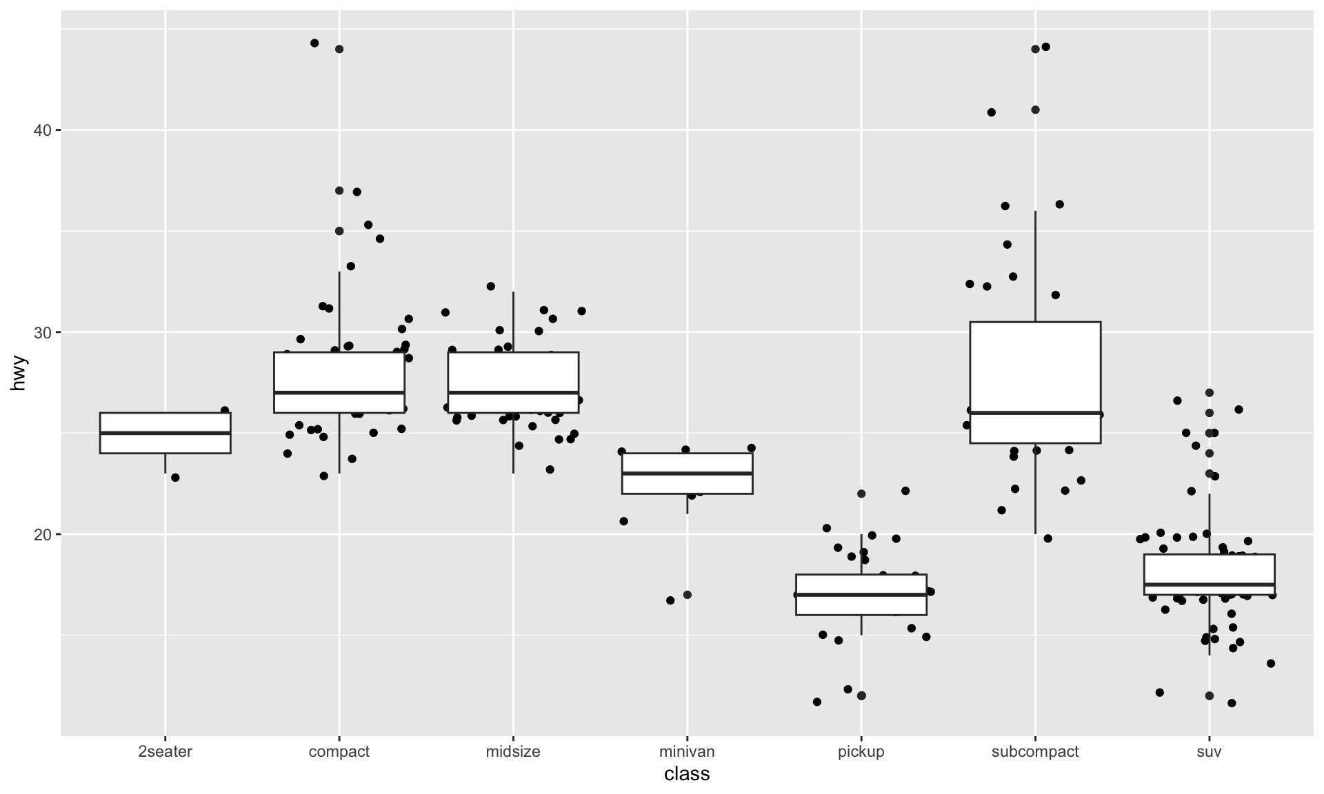
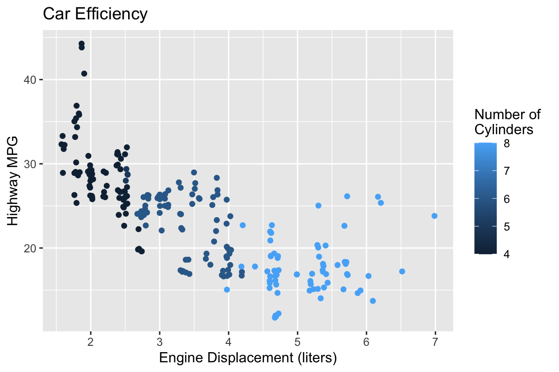
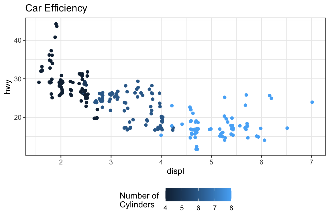
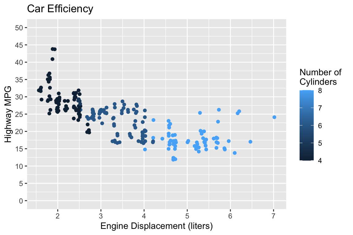
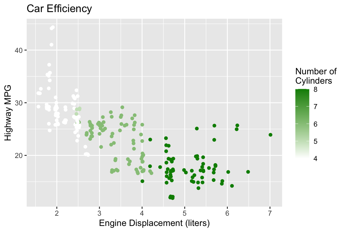
Plot Customizations
PA 2: Using Data Visualization to Find the Penguins
Artwork by Allison Horst