Simulation + Nice Tables
Statistical Distributions
Recall from your statistics classes…
A random variable is a value we don’t know until we observe an instance.
- Coin flip: could be heads (0) or tails (1)
- Person’s height: could be anything from 0 feet to 10 feet.
- Annual income of a US worker: could be anything from $0 to $1.6 billion
The distribution of a random variable tells us its possible values and how likely they are.
- Coin flip: 50% chance of heads and tails.
- Heights follow a bell curve centered at 5 foot 7.
- Most American workers make under $100,000.

Statistical Distributions with Names!
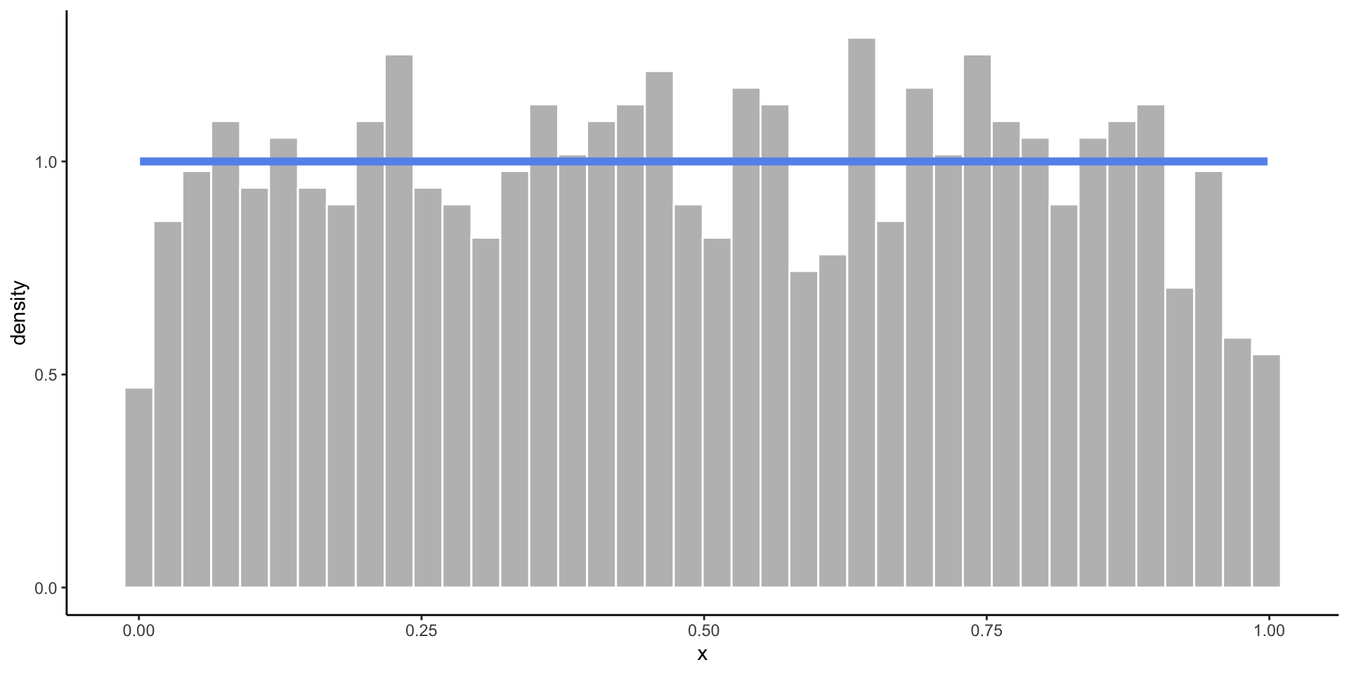
Uniform Distribution
- When you know the range of values, but not much else.
- All values in the range are equally likely to occur.
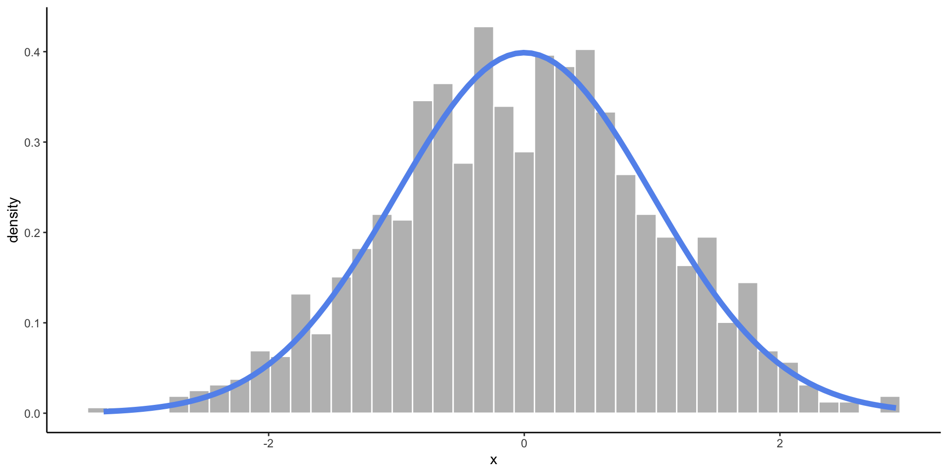
Normal Distribution
- When you expect values to fall near the center.
- Frequency of values follows a bell shaped curve.
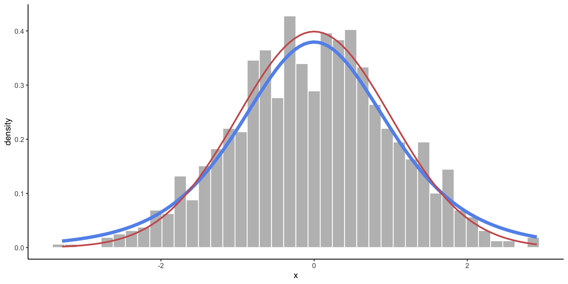
t-Distribution
- A slightly wider bell curve.
- Basically used in the same context as the normal distribution, but more common with real data (when the standard deviation is unknown).
Chi-Square Distribution
- Somewhat skewed, and only allows values above zero.
- Commonly used in statistical testing.
Binomial Distribution
- There are two possible outcomes, and you are counting how many times one of the outcomes occured out of a fixed number of trials.
- Takes discrete values from 0 to the number of trials.
Distribution Functions in R
r is for random sampling.
- Generate random values from a distribution.
- We use this to simulate data (create pretend observations).
p is for probability.
- Compute the chances of observing a value less than
x: \(P(X < x)\) - We use this for calculating p-values.

q is for quantile.
- Given a probability \(p\), compute \(x\) such that \(P(X < x) = p\).
- The
qfunctions are “backwards” of thepfunctions.
d is for density.
- Compute the height of a distribution curve at a given \(x\).
- For discrete dist: probability of getting exactly \(x\).
- For continuous dist: usually meaningless.
Probability of exactly 12 heads in 20 coin tosses, with a 70% chance of tails?
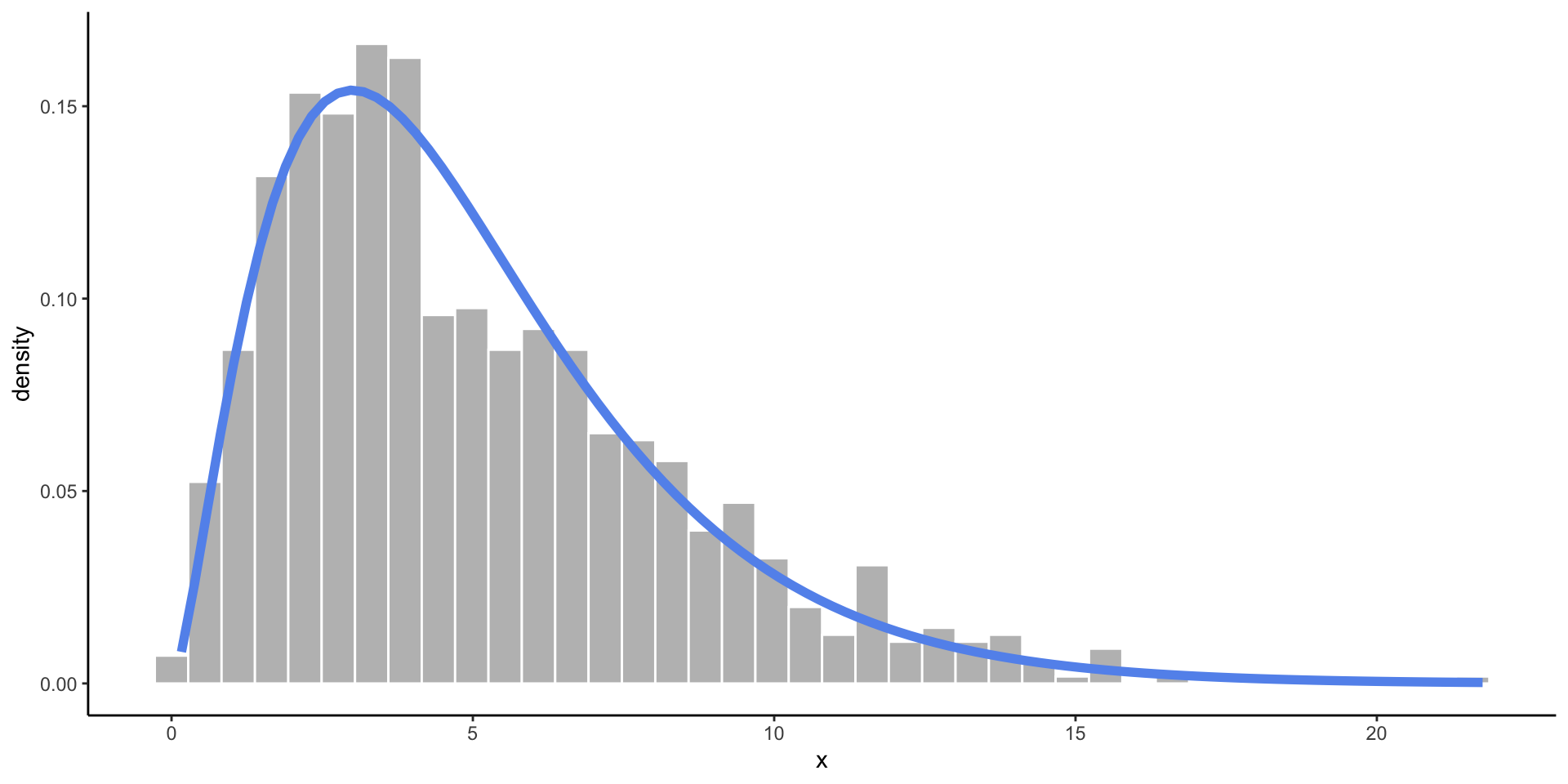
Empirical vs. Theoretical Distributions
Empirical: the observed data.


Plotting Both Distributions


Simulate a Dataset
| names | height | age | measure | supports_measure_A |
|---|---|---|---|---|
| Elbridge Kautzer | 67.43632 | 66.29460 | 1 | yes |
| Brandon King | 64.99480 | 61.53720 | 0 | no |
| Phyllis Thompson | 68.09035 | 53.83715 | 1 | yes |
| Humberto Corwin | 67.45541 | 33.87560 | 1 | yes |
| Theresia Koelpin | 71.37196 | 16.12199 | 1 | yes |
| Hayden O'Reilly-Johns | 66.17853 | 36.96293 | 0 | no |
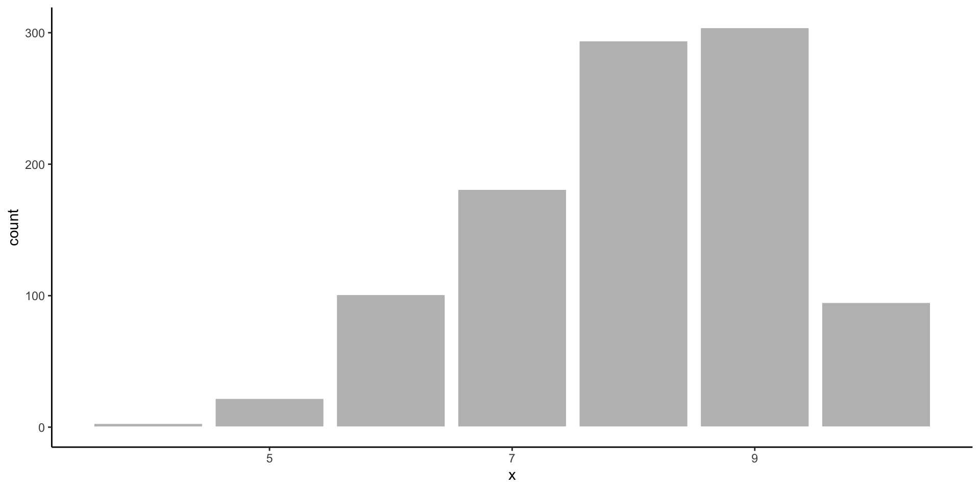
Check to see the ages look uniformly distributed.

Remember the Data Science Process
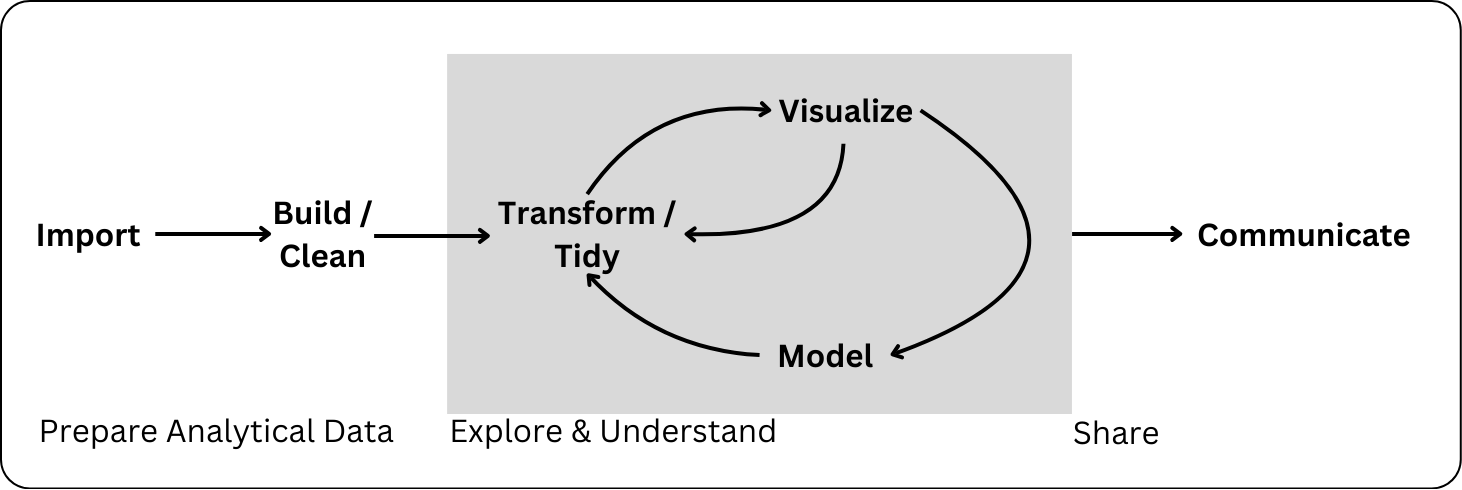
Communicating about your analysis and findings is a key element of statistical computing.
Plot Design
Code
sec.cols <- c("#fdb462", "#b3de69")
trip.cols <- c("#fb8072", "#80b1d3")
fish <- fish |>
mutate(trip = str_c("Trip ", trip)) |>
mutate(across(.cols = c(trip, section, species),
.fns = ~ as.factor(.x)))
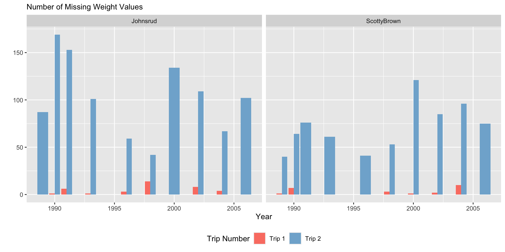
fish |>
filter(if_any(.cols = everything(),
.fns = ~ is.na(.x))) |>
ggplot(aes(x = year,
fill = trip)) +
geom_bar() +
facet_grid(~ section) +
scale_fill_manual(values = trip.cols) +
labs(y = "",
subtitle = "Number of Missing Weight Values",
x = "Year",
fill = "Trip Number")
fish |>
filter(if_any(.cols = everything(),
.fns = ~ is.na(.x))) |>
ggplot(aes(x = year,
fill = trip)) +
geom_bar(position = "dodge") +
facet_grid(~ section) +
scale_fill_manual(values = trip.cols) +
labs(y = "",
subtitle = "Number of Missing Weight Values",
x = "Year",
fill = "Trip Number") +
theme(legend.position = "bottom")
fish |>
filter(if_any(.cols = everything(),
.fns = ~ is.na(.x))) |>
ggplot(aes(x = year,
fill = section)) +
geom_bar() +
facet_grid(~ trip) +
scale_fill_manual(values = sec.cols) +
labs(y = "",
subtitle = "Number of Missing Weight Values",
x = "Year",
fill = "Section")
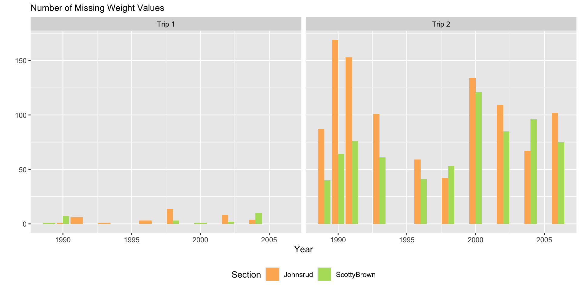
fish |>
filter(if_any(.cols = everything(),
.fns = ~ is.na(.x))) |>
ggplot(aes(x = year,
fill = section)) +
geom_bar(position = "dodge") +
facet_grid(~ trip) +
scale_fill_manual(values = sec.cols) +
labs(y = "",
subtitle = "Number of Missing Weight Values",
x = "Year",
fill = "Section") +
theme(legend.position = "bottom")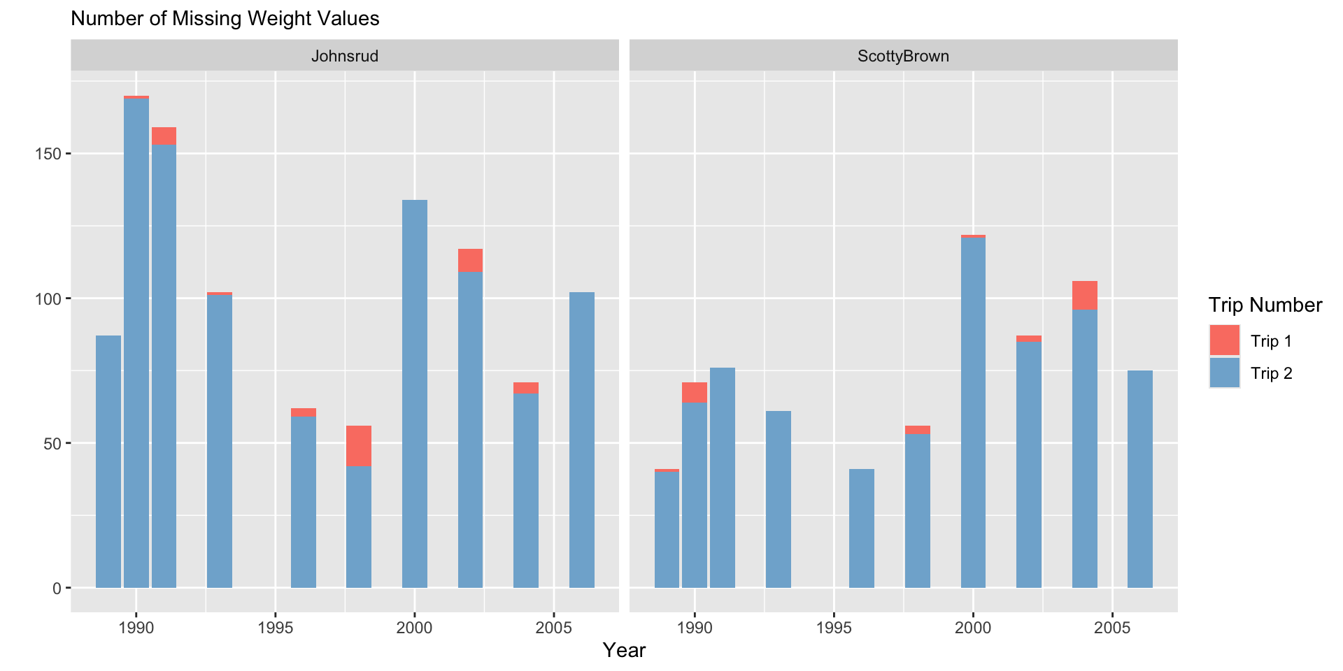
Plot Design
Code
fish_sum <- fish |>
group_by(year, section, trip) |>
summarize(n_miss = sum(is.na(weight)))
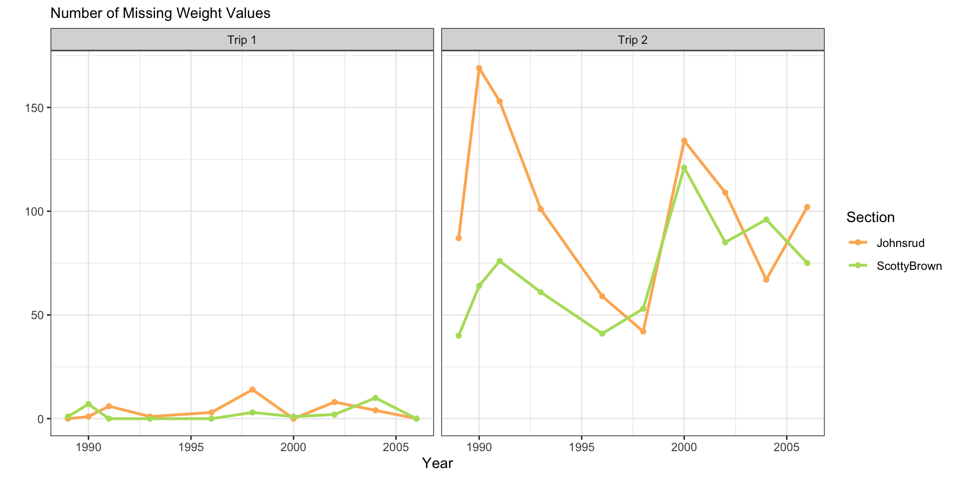
fish_sum |>
ggplot(aes(x = year,
y = n_miss,
color = trip)) +
geom_line(linewidth = 1) +
geom_point() +
facet_grid(cols = vars(section)) +
scale_color_manual(values = trip.cols) +
theme_bw() +
labs(y = "",
subtitle = "Number of Missing Weight Values",
x = "Year",
color = "Trip")
fish_sum |>
ggplot(aes(x = year,
y = n_miss,
color = section)) +
geom_line(linewidth = 1) +
geom_point() +
facet_grid(cols = vars(trip)) +
scale_color_manual(values = sec.cols) +
theme_bw() +
labs(y = "",
subtitle = "Number of Missing Weight Values",
x = "Year",
color = "Section")
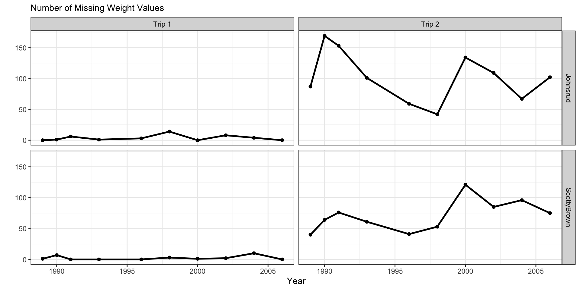
fish_sum |>
ggplot(aes(x = year,
y = n_miss)) +
geom_line(linewidth = 1) +
geom_point() +
facet_grid(cols = vars(trip),
rows = vars(section)) +
theme_bw() +
labs(y = "",
subtitle = "Number of Missing Weight Values",
x = "Year")
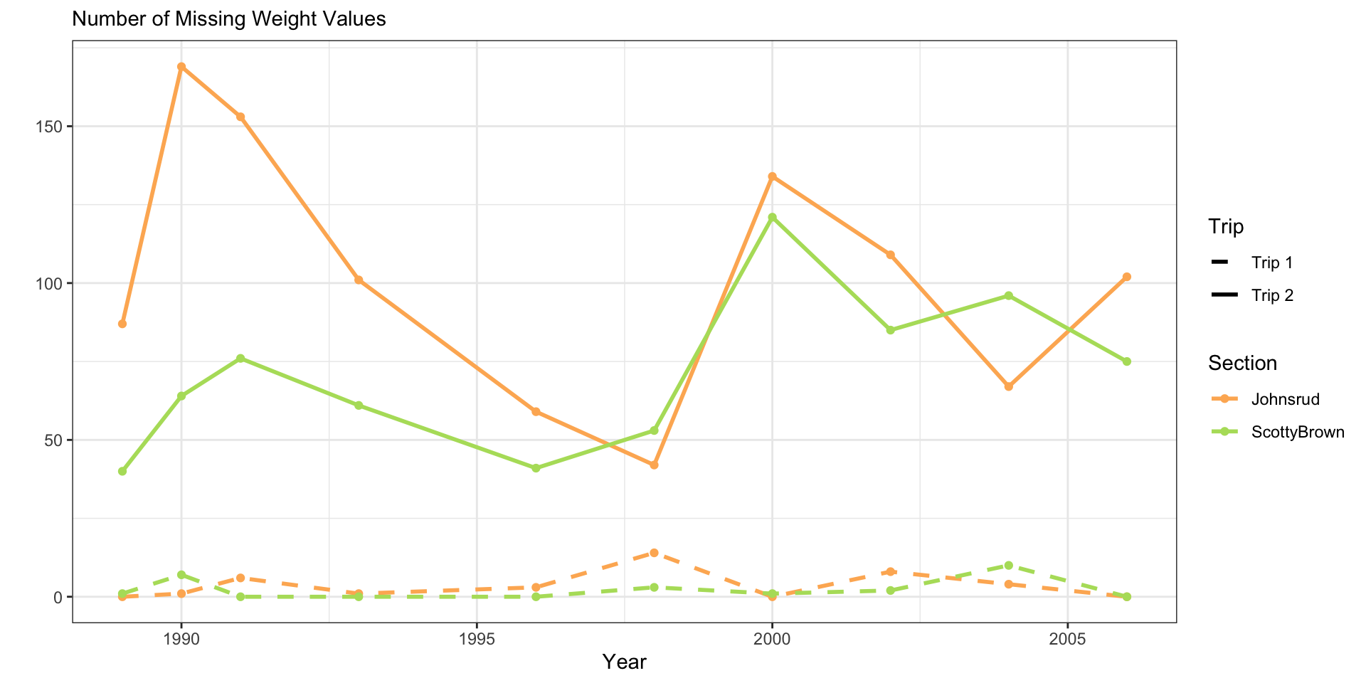
fish_sum |>
ggplot(aes(x = year,
y = n_miss,
color = section,
linetype = trip)) +
geom_line(linewidth = 1) +
geom_point() +
scale_color_manual(values = sec.cols) +
scale_linetype_manual(values = c(2, 1)) +
theme_bw() +
labs(y = "",
subtitle = "Number of Missing Weight Values",
x = "Year",
color = "Section",
linetype = "Trip")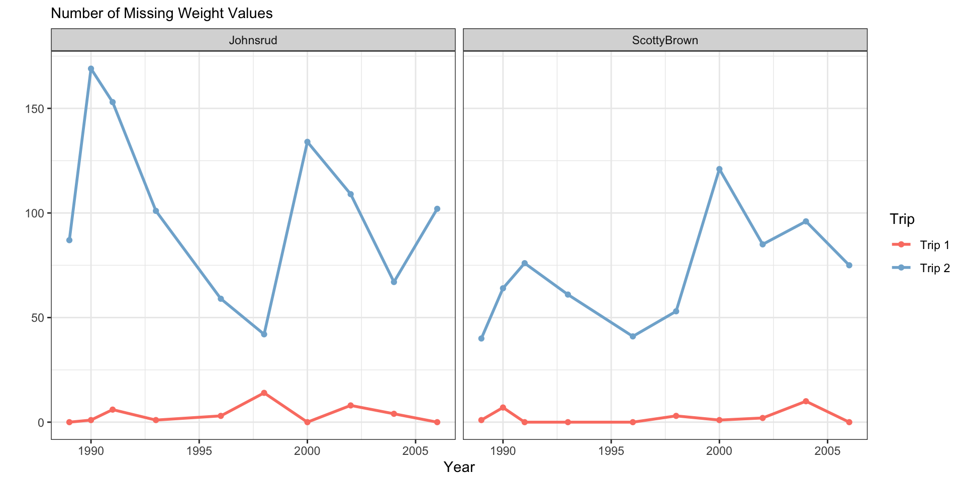
Report Ready Tables in R
- We have just shown data tables directly, midly formatting for html using
kable()
- We can make report-ready tables using
kableExtraorgt!


Yay reproducibility!
Nice tables with kable() and kableExtra functions
Nice tables with the gt package
- Fancy, report tables
- Lots of formatting options for common variable types
- Syntax less error-prone
- Create labels directly with markdown!
- Get started
- Full index of functions
PA 8.2: Instrument Con
Work with statistical distributions to determine if an instrument salesman is lying.

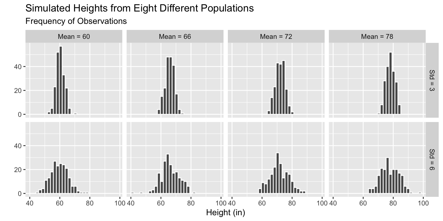
Simulate Multiple Datasets - Step 5
Plot the samples simulated from each population.
Code
fake_ht_data |>
  mutate(across(.cols = mean_ht:std_ht,
                .fns = ~as.character(.x)),
         mean_ht = fct_recode(mean_ht,
                              `Mean = 60` = "60",
                              `Mean = 66` = "66",
                              `Mean = 72` = "72",
                              `Mean = 78` = "78"),
         std_ht = fct_recode(std_ht,
                             `Std = 3` = "3",
                             `Std = 6` = "6")
         ) |>
  ggplot(mapping = aes(x = ht)) +
  geom_histogram(color = "white") +
  facet_grid(std_ht ~ mean_ht) +
  labs(x = "Height (in)",
       y = "",
       subtitle = "Frequency of Observations",
       title = "Simulated Heights from Eight Different Populations")