Importing Data and Graphics with ggplot2
Tidywho?
The tidyverse is an opinionated collection of R packages designed for data science. All packages share an underlying design philosophy, grammar, and data structures.1
- Most of the functionality you will need for an entire data analysis workflow with cohesive grammar
Tidy Data
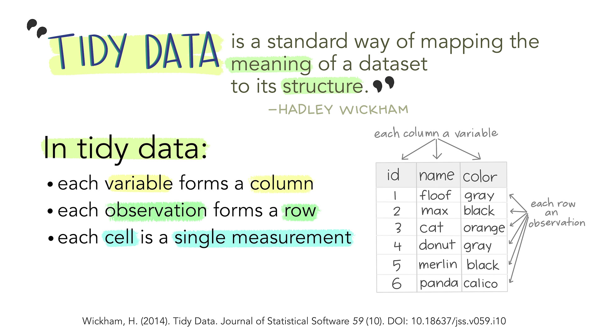
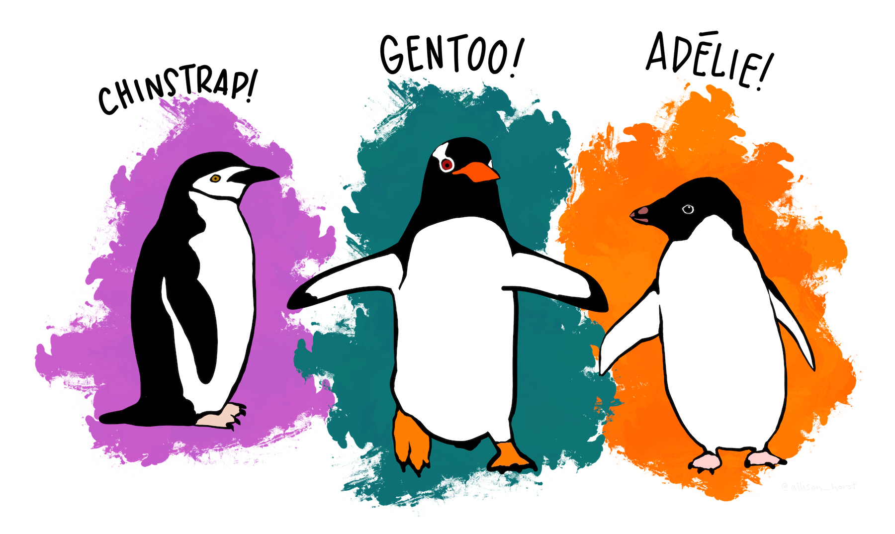
Artwork by Allison Horst
Data Science Workflow

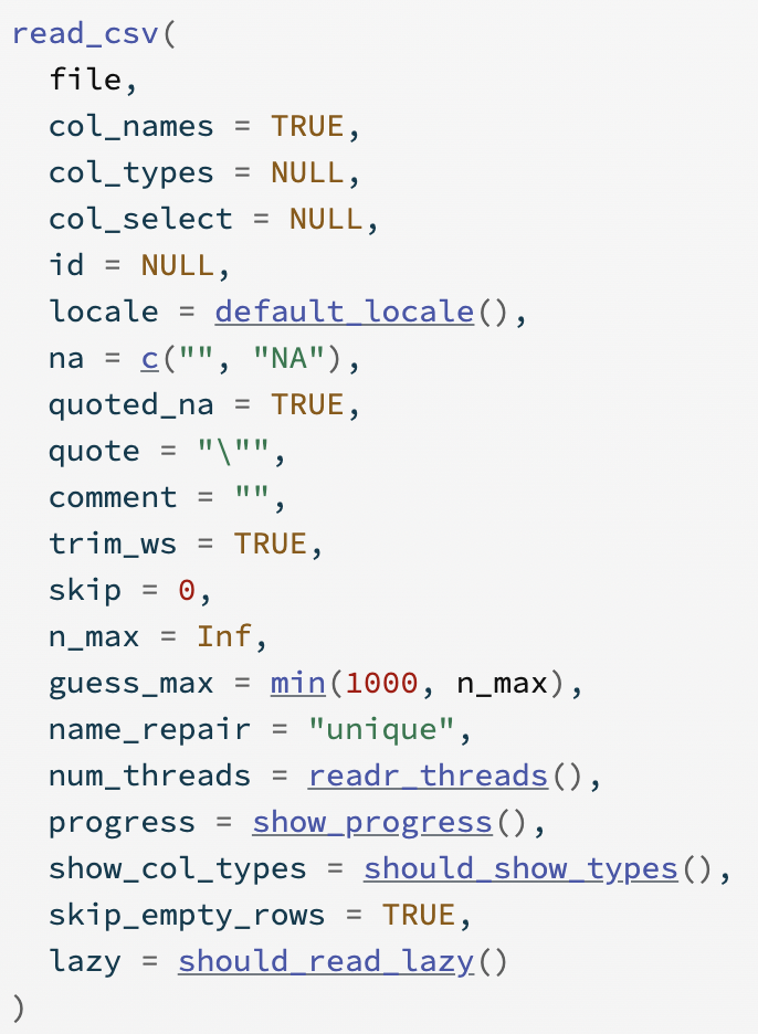
Common Types of Data Files


Take a look at the documentation

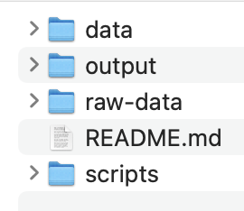
Reminder: Notebooks and File Paths
You have to tell
Rwhere to “find” the data you want to read in using a file path.Quarto automatically sets the working directory to the be directory where the Quarto document is for any code within the Quarto document
This overrides the directory set by an .Rproj
Pay attention to this when setting relative filepaths
- To “backout” of one directory, use
"../" - e.g.:
"../data/dat.csv"
- To “backout” of one directory, use
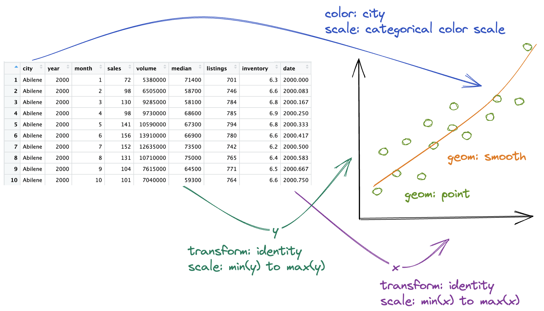
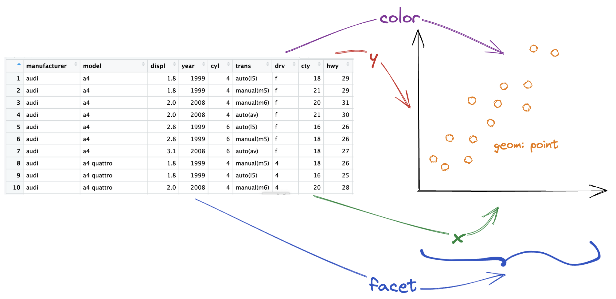
How to Build a Graphic
Complete this template to build a basic graphic:

- We use
+to add layers to a graphic.


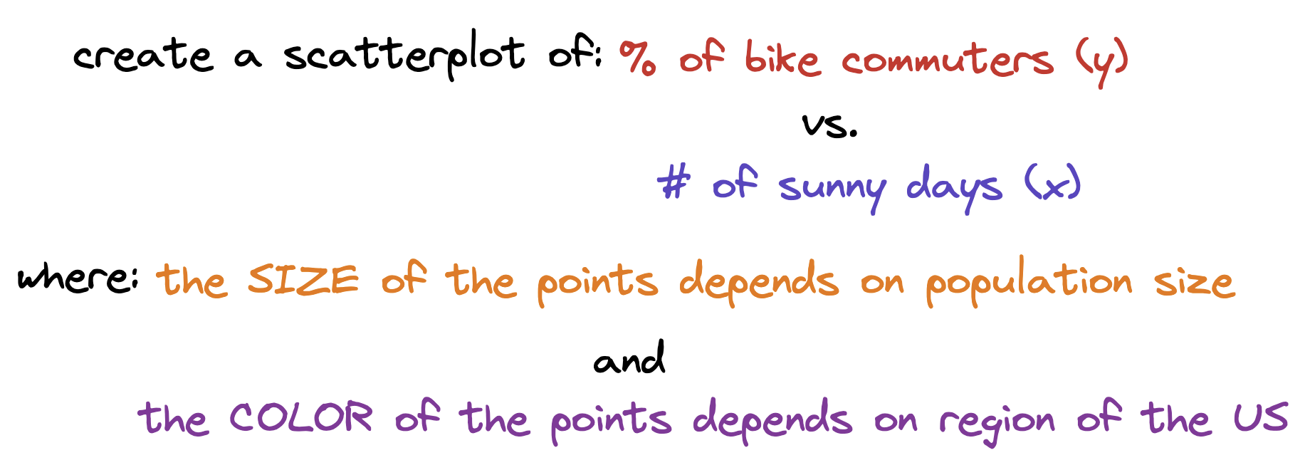
Aesthetics
We map variables (columns) from the data to aesthetics on the graphic useing the aes() function.
What aesthetics can we set (see ggplot2 cheat sheet for more)?
- x, y
- color, fill
- linetype
- lineend
- size
- shape
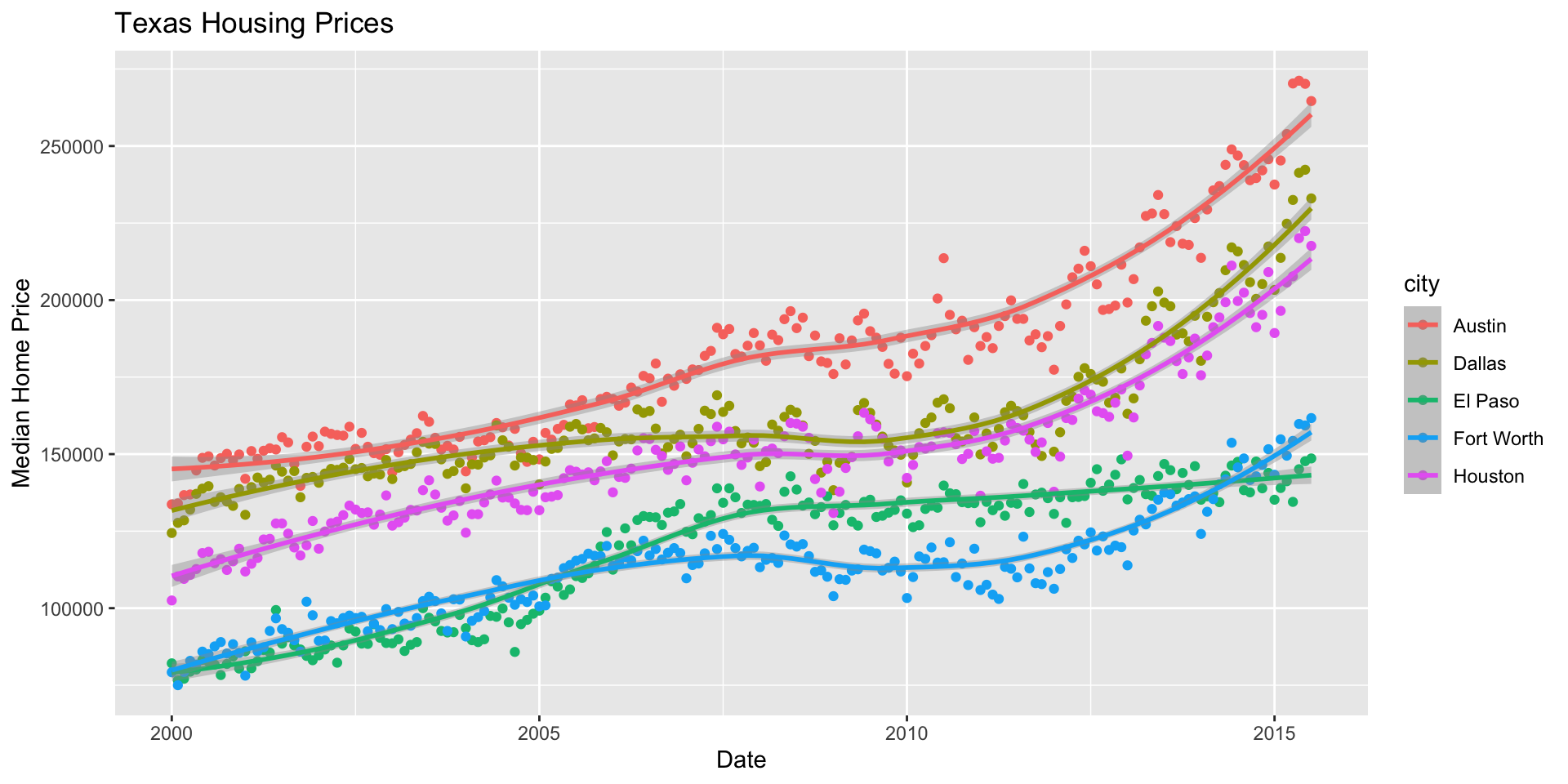
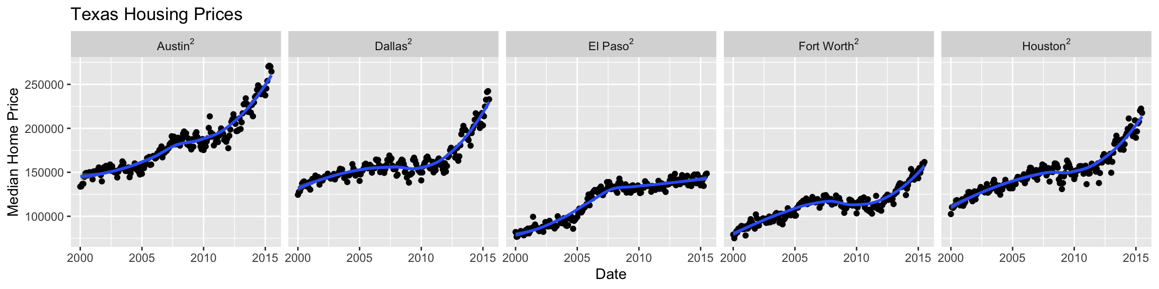
Start with the TX housing data.
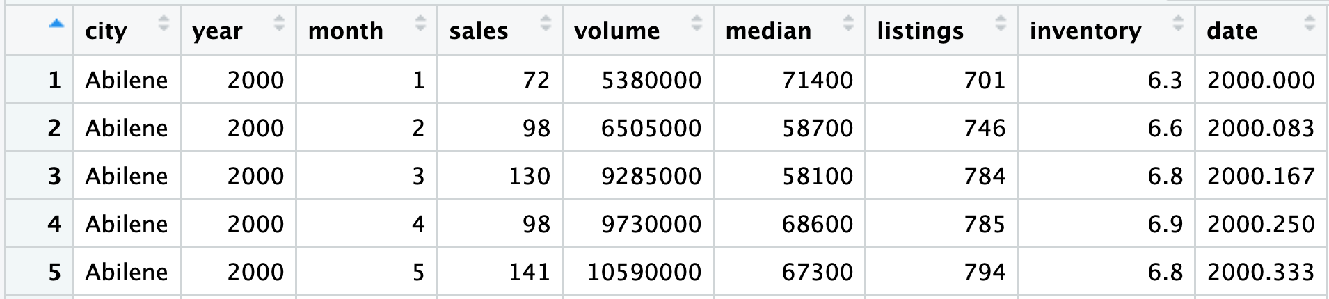
Make a plot of median house price over time (including both individual data points and a smoothed trend line), distinguishing between different cities.
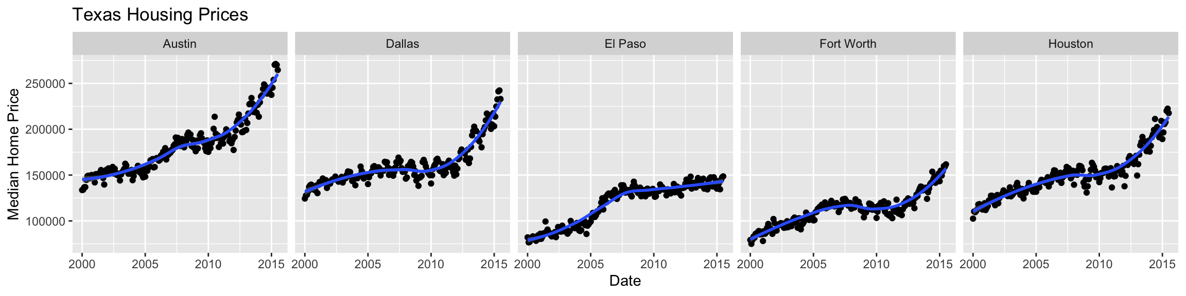
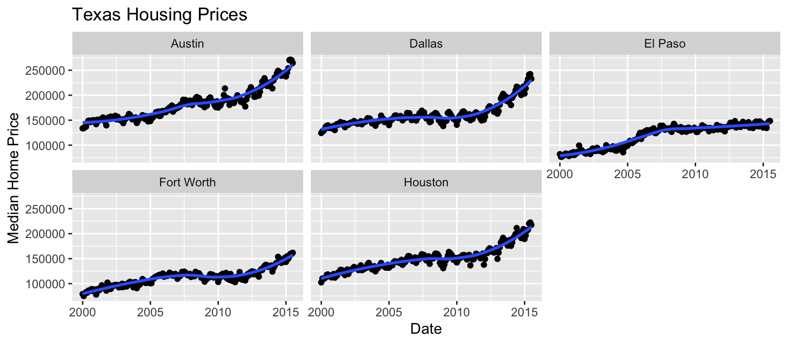
Faceting
Extracts subsets of data and places them in side-by-side plots.
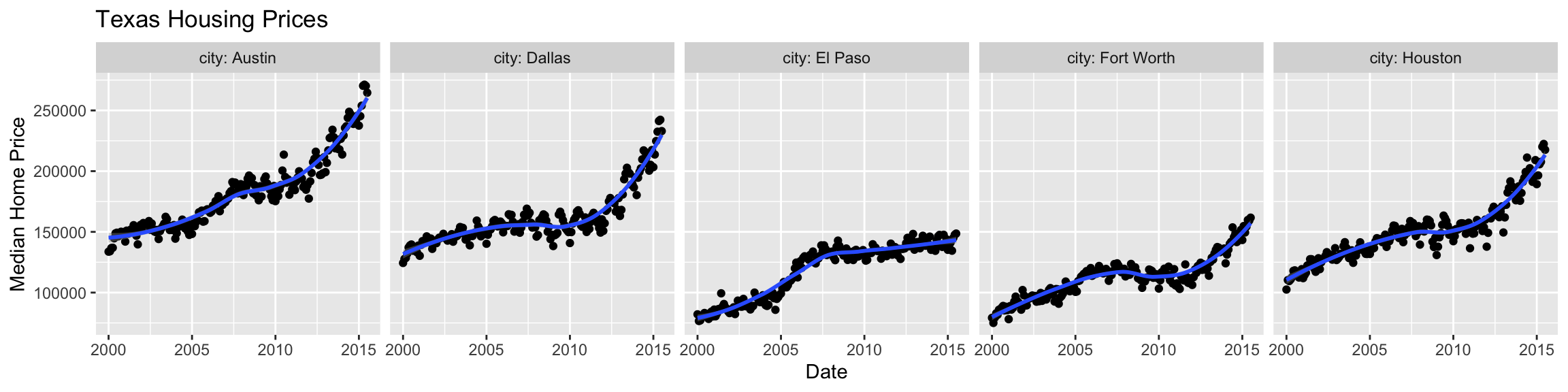
Example Facet Labels
Including the variable and facet names using label_both:
Including math labels in facet names using label_bquote:
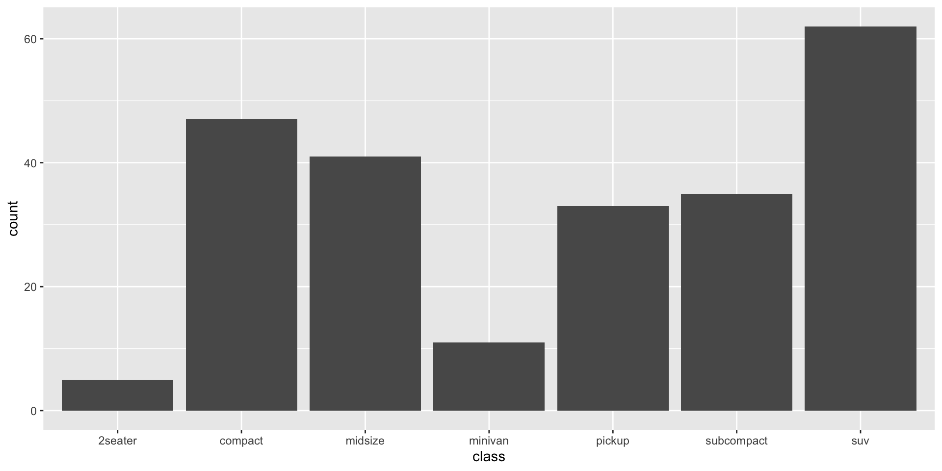
Statistical Transformation: stat

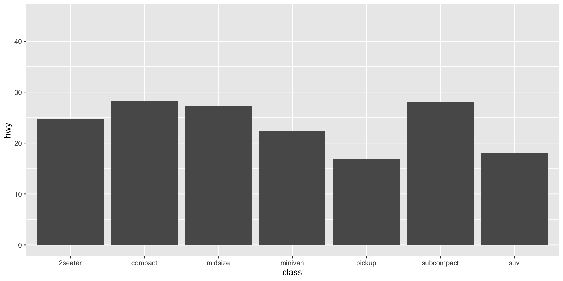
Position Adjustements

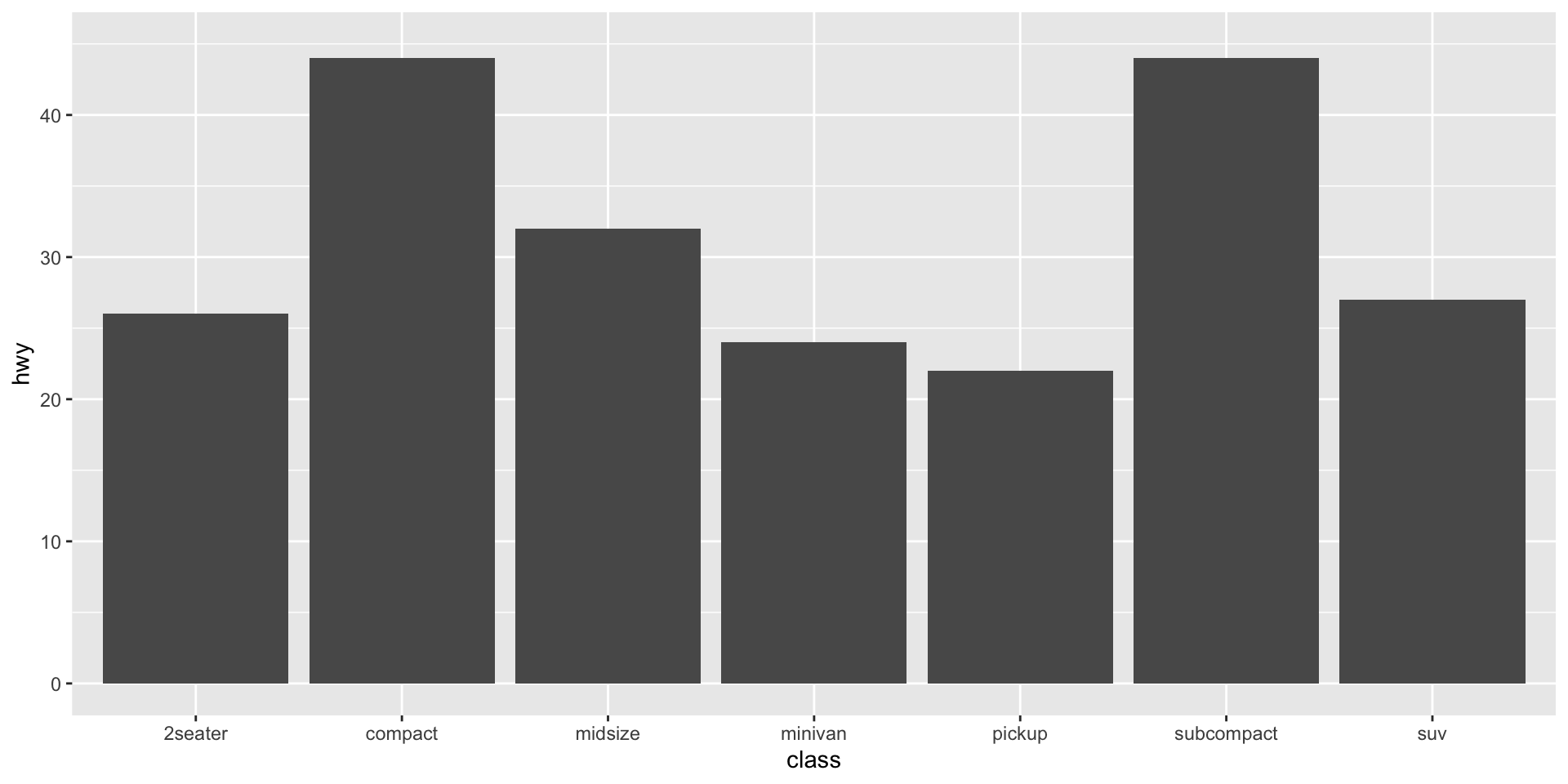
Plot Customizations
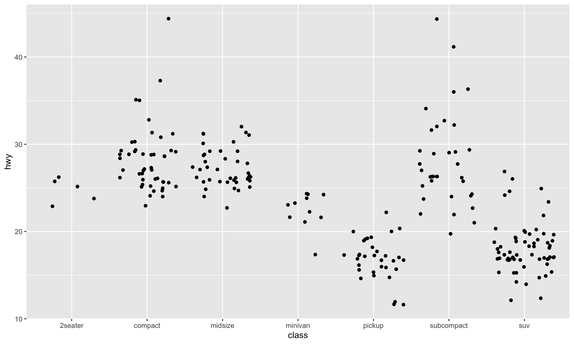
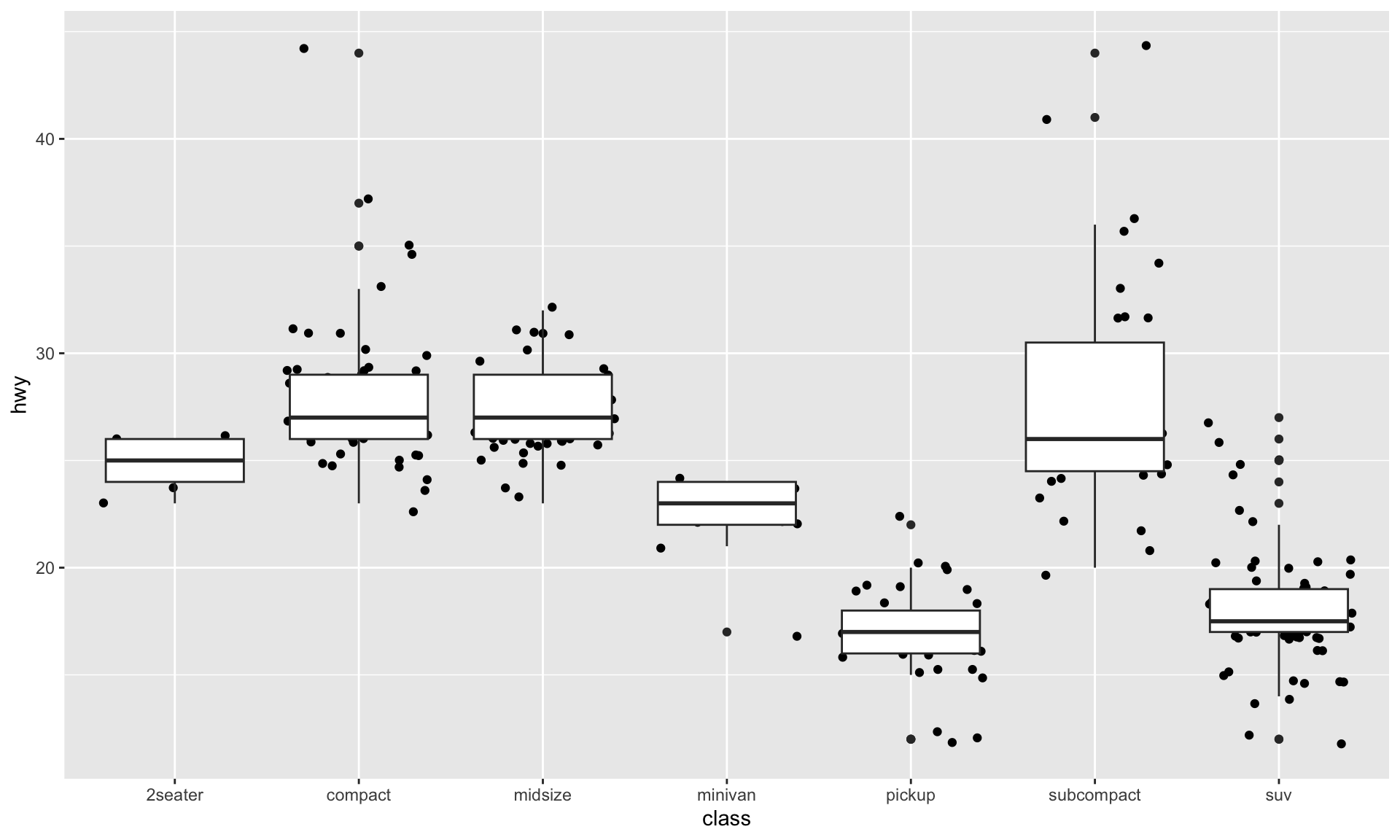
Let’s Practice!
How would you make this plot from the diamonds dataset in ggplot2?
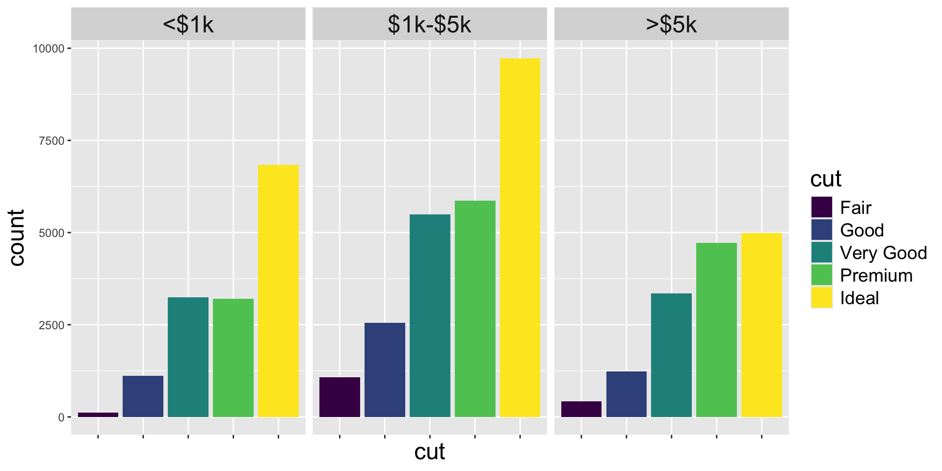
dataaesgeomfacet
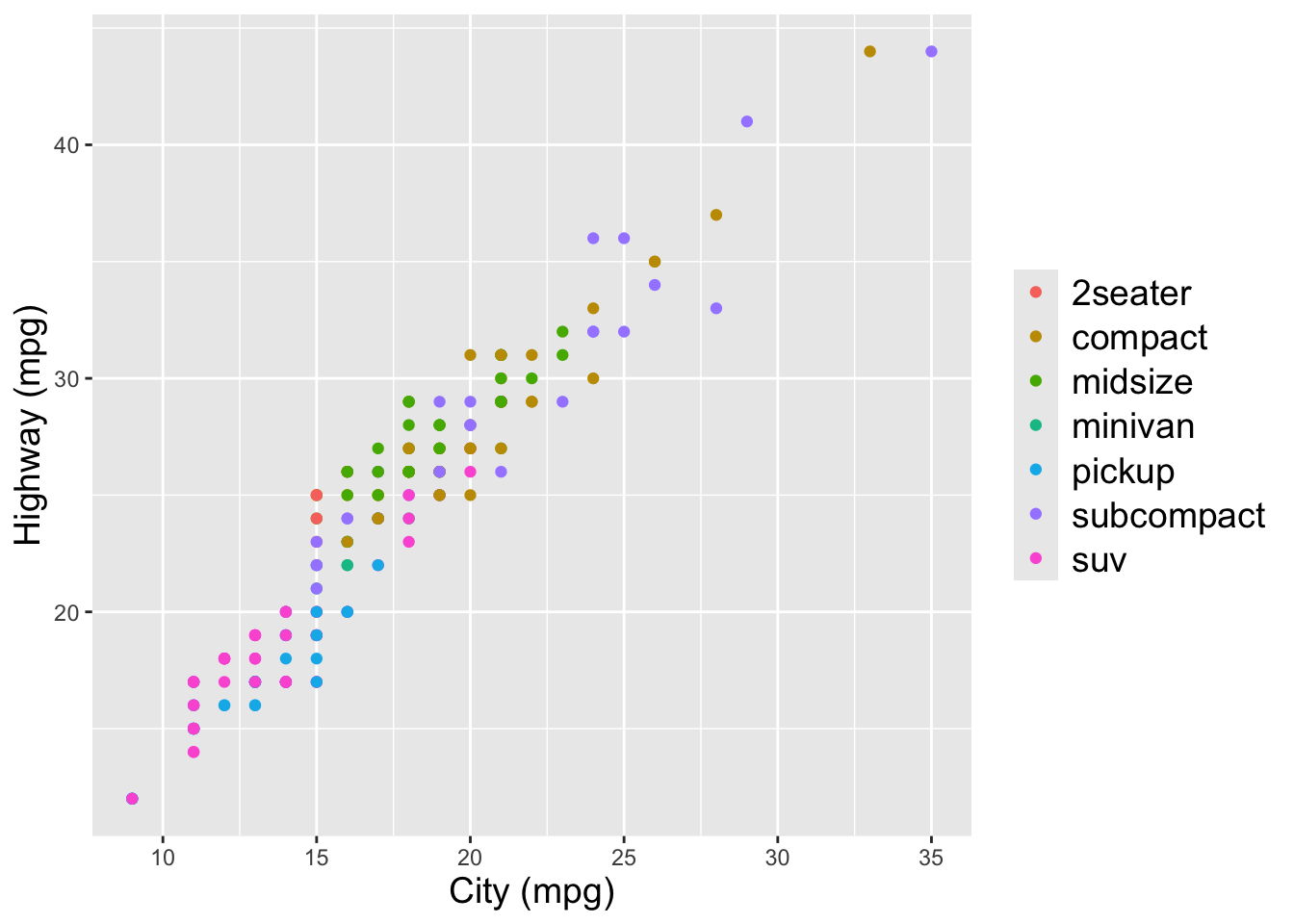
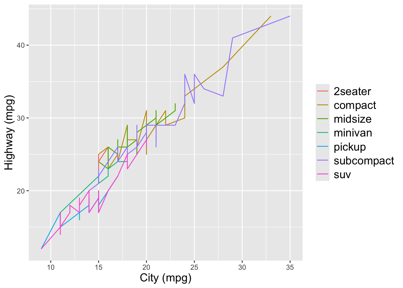
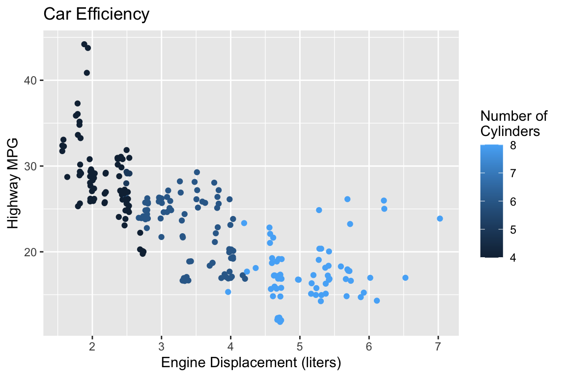
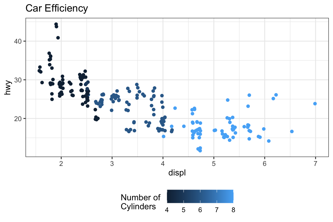
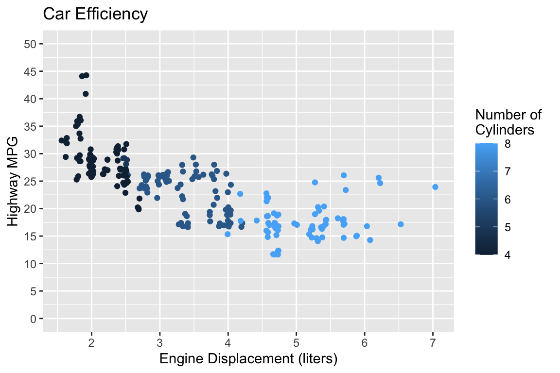
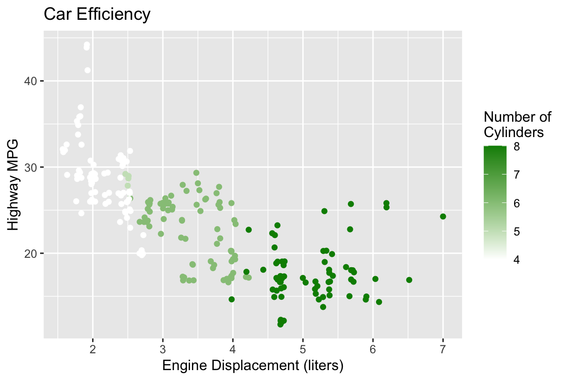
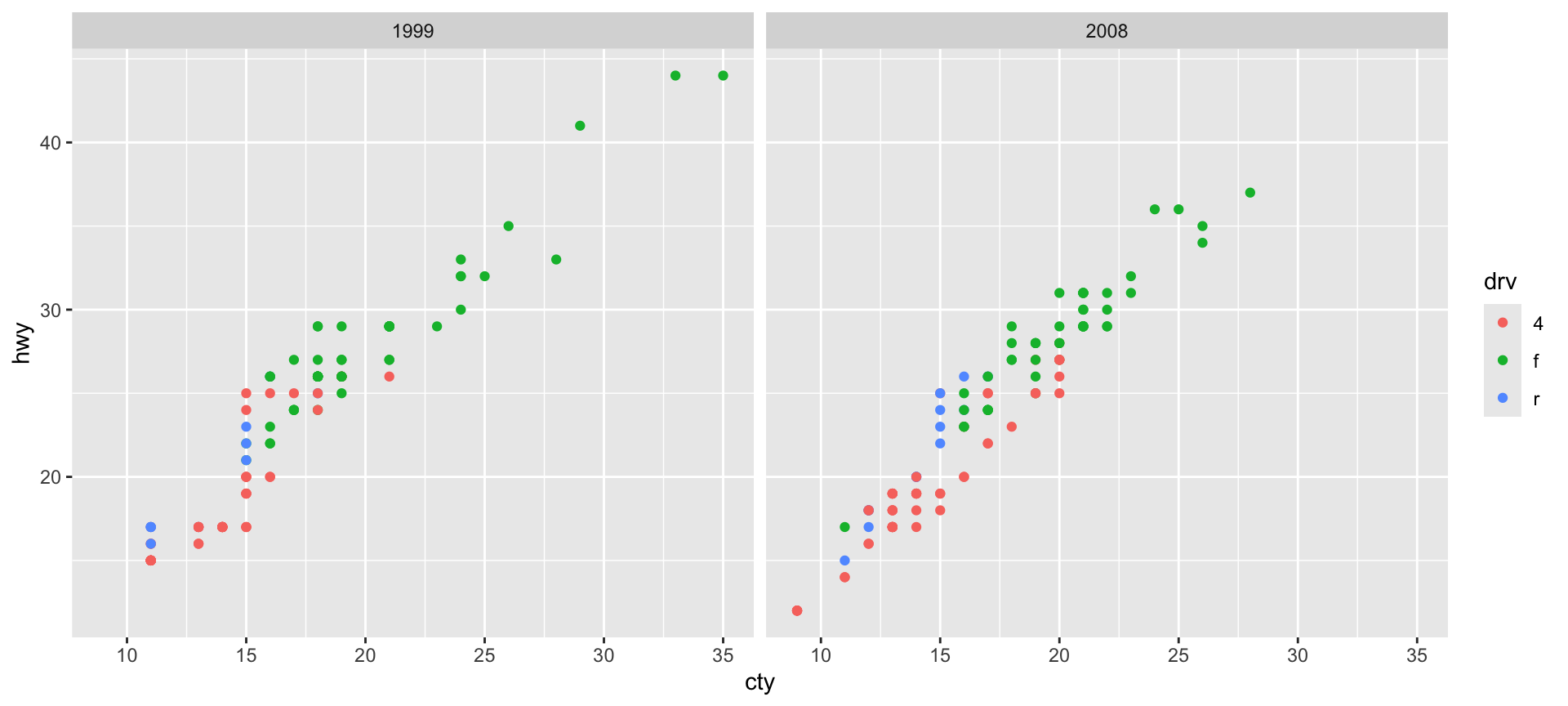
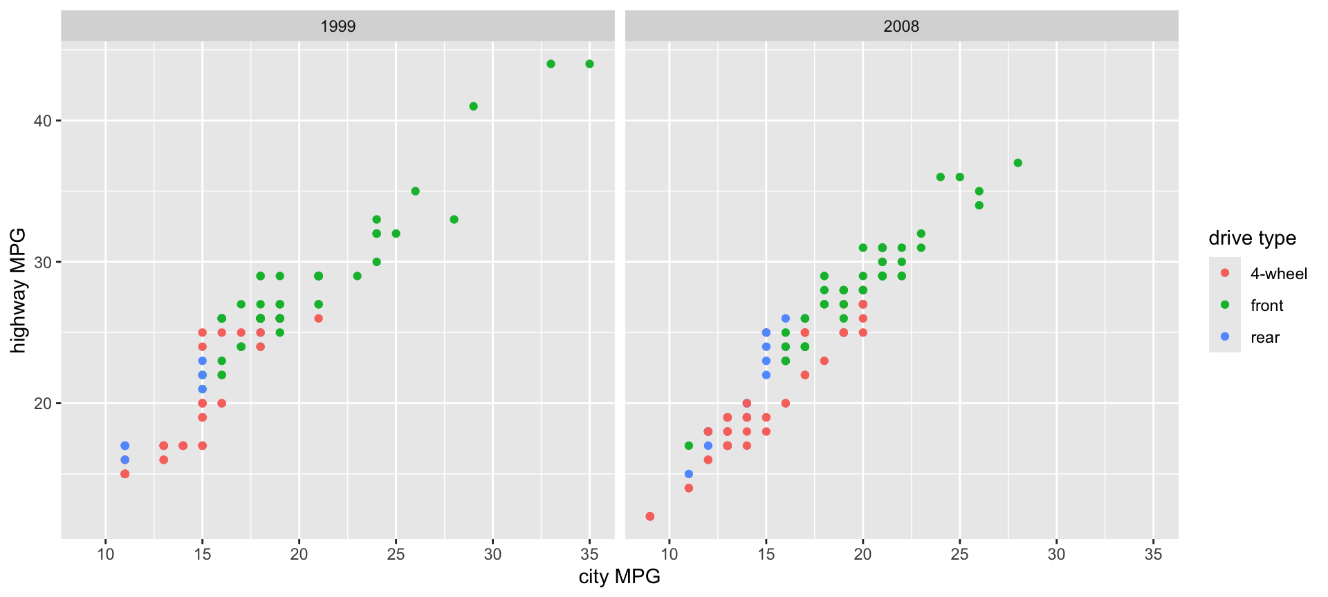
Use the mpg dataset to create two side-by-side scatterplots of city MPG vs. highway MPG where the points are colored by the drive type (drv). The two plots should be separated by year.
![]()
PA 2: Using Data Visualization to Find the Penguins
Artwork by Allison Horst