Basics of Graphics
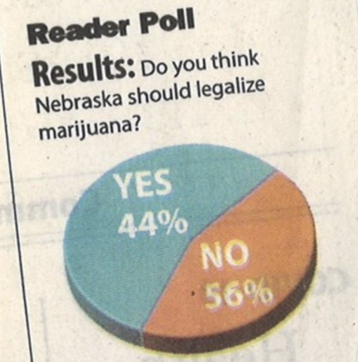
What makes bad graphics bad?
- BAD DATA.
- Too much “chartjunk” – superfluous details (Tufte).
- Design choices that are difficult for the human brain to process, including:
- Colors
- Orientation
- Organization
Pre-attentive Features

Pre-attentive Features

Double Encoding

No Double Encoding

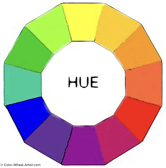
Color
- Color, hue, and intensity are pre-attentive features, and bigger contrasts lead to faster detection.
- Hue: main color family (red, orange, yellow…)
- Intensity: amount of color

Color Guidelines
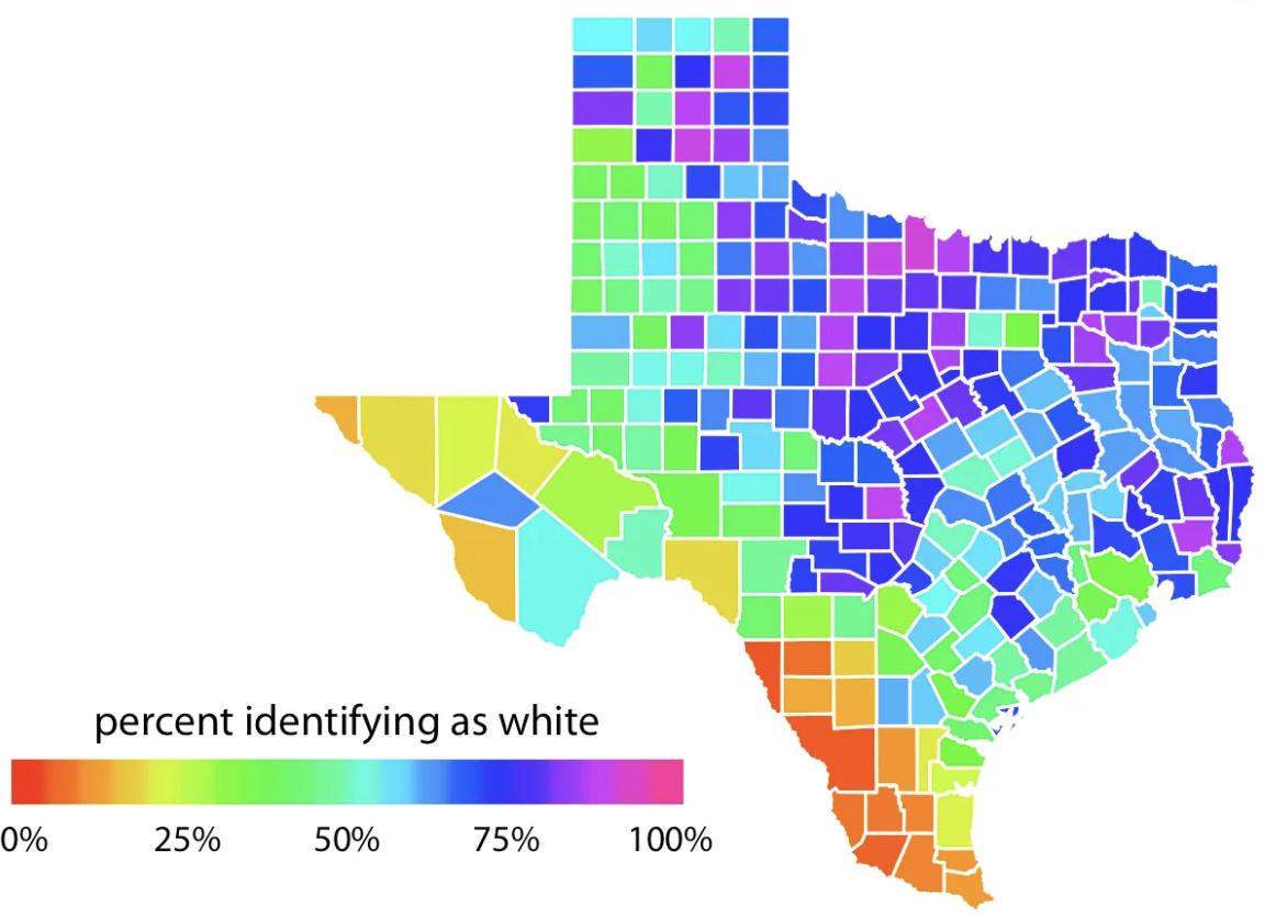
Do not use rainbow color gradients!
Be conscious of what certain colors “mean”.
- Good idea to use red for “good” and green for “bad”?
Color Guidelines
- For categorical data, try not to use more than 7 colors:

Can use colorRampPalette() from the RColorBrewer package to produce larger palettes:

Color Guidelines
To colorblind-proof a graphic…
- use double encoding - when you use color, also use another aesthetic (line type, shape, etc.).
Color Guidelines
To colorblind-proof a graphic…
- with a unidirectional scale (e.g., all + values), use a monochromatic color gradient.

- with a bidirectional scale (e.g., + and - values), use a purple-white-orange color gradient. Transition through white!

Color Guidelines
To colorblind-proof a graphic…
- print your chart out in black and white – if you can still read it, it will be safe for all users.
Penguins - Flipper Length by Species


Penguins - Flipper Length by Species & Sex


PA 2 Example - Two Categorical Variables


Lecture Example - Texas Housing Data


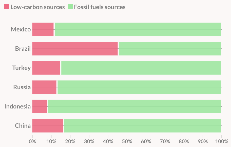
Example 1

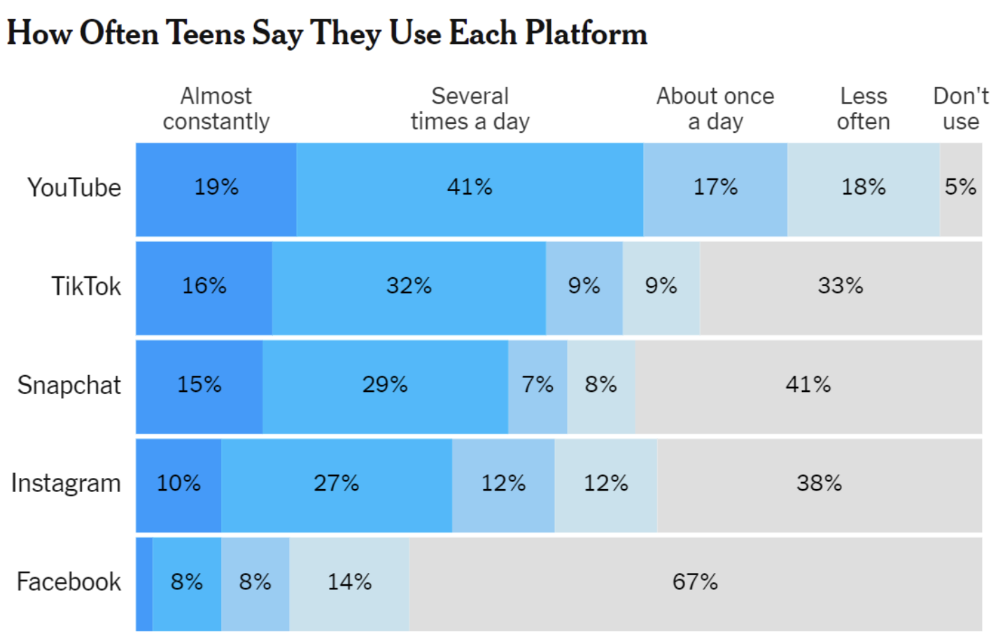
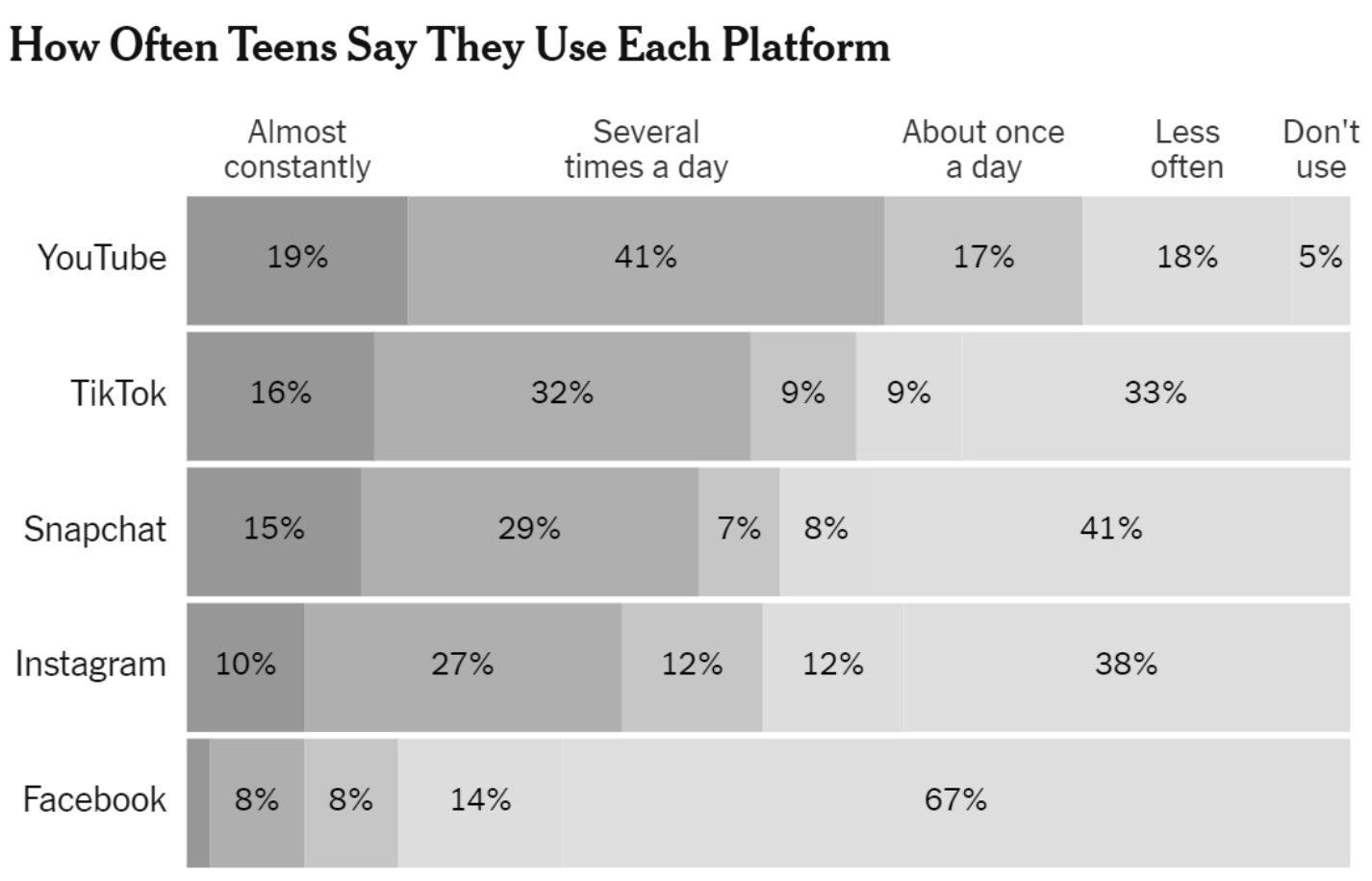
Example 2
https://www.data-to-viz.com/graph/area.html
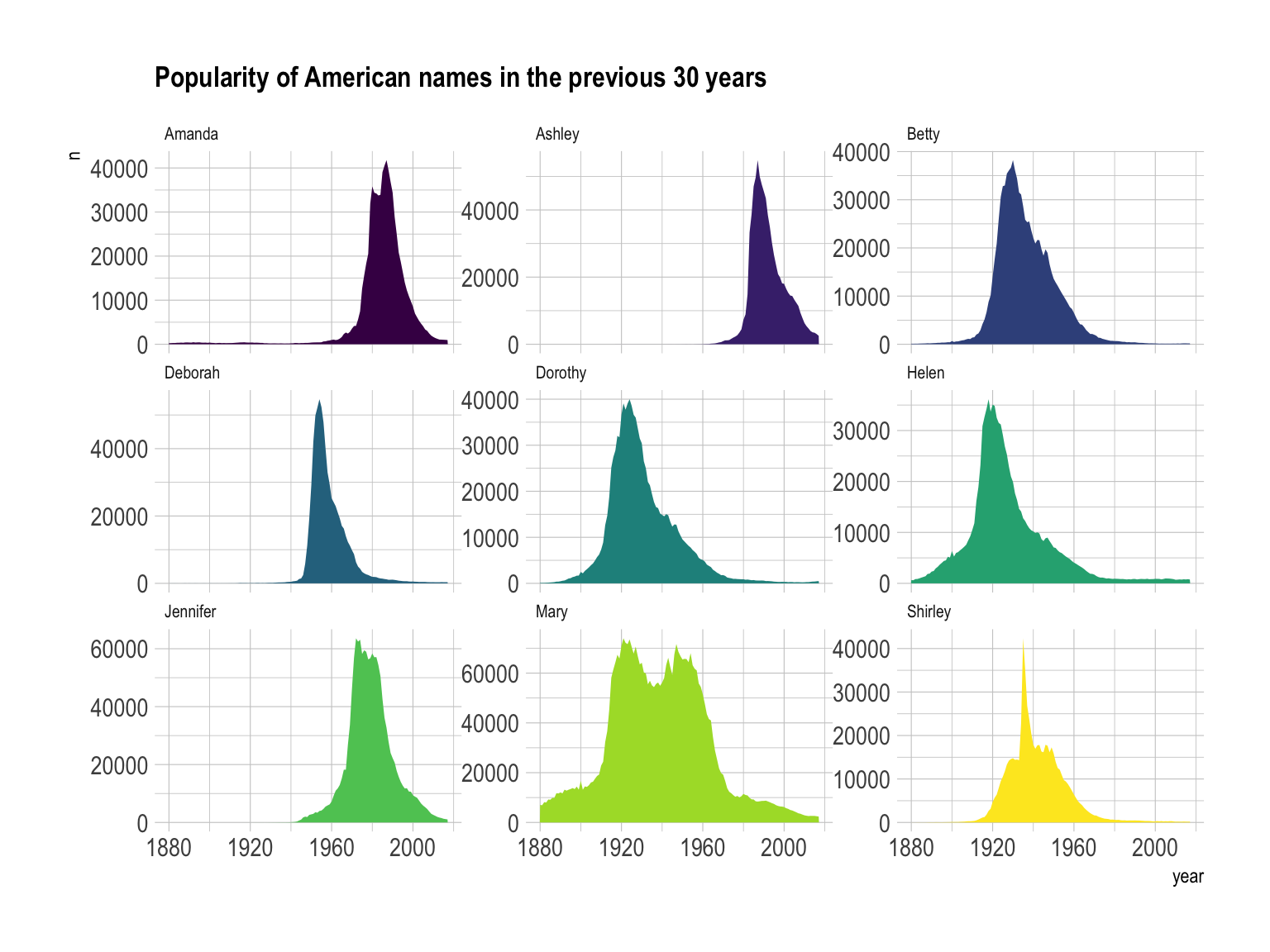
Example 3
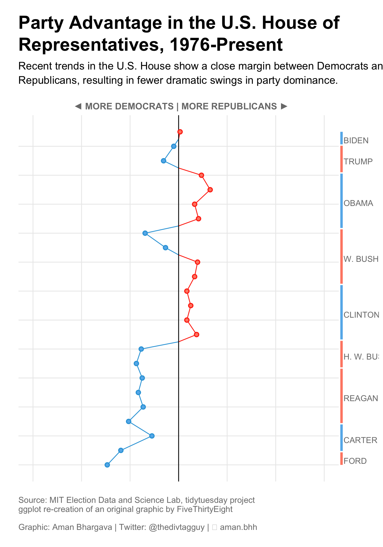
https://r-graph-gallery.com/web-vertical-line-chart-with-ggplot2.html
Example 4
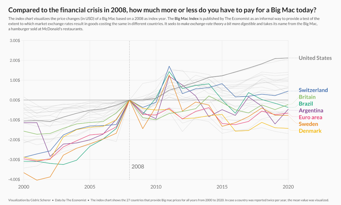
https://r-graph-gallery.com/web-line-chart-with-labels-at-end-of-line.html
Lab 2: Exploring Rodents with ggplot2

ggplot2 cheatsheet